STYLE.md · Restrained · tactile · assured
How Atelier works. Every rule, written down.
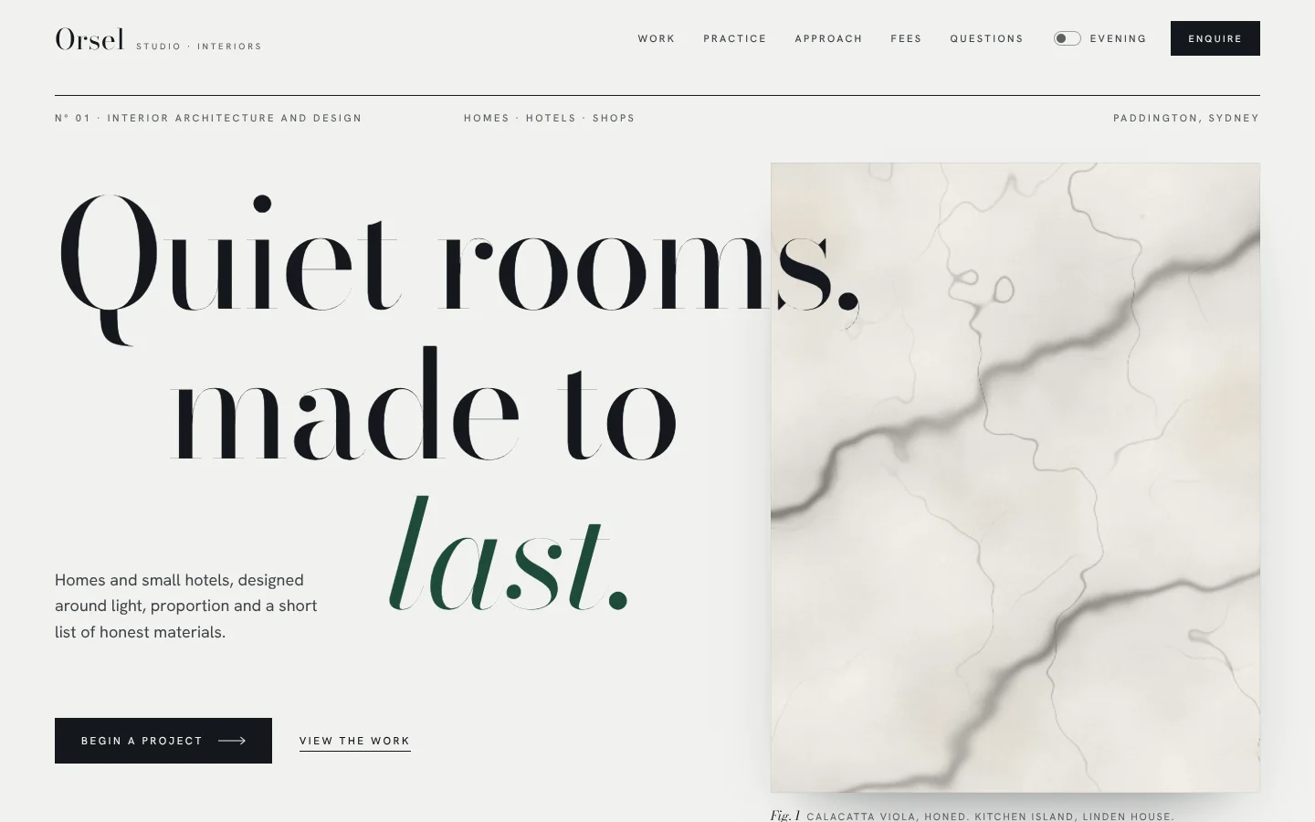
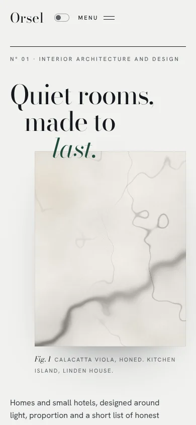
Atelier reads like the opening spread of a fashion-house lookbook or an architecture quarterly. A Bodoni headline, set enormous and light, steps down the page in staggered indents and runs over the edge of a tall panel of honed marble. The panels are drawn live in canvas (marble, travertine, oak, velvet, linen, limewash, brushed brass), so every site gets its own materials without a single stock photo. Labels are small, tracked and quiet; numerals are big; rules are a hair wide. Motion is slow and expensive: headlines rise out of masks line by line, panels unveil and settle from a slight zoom as they scroll in, a collection glides sideways under a cursor ring, and buttons lean toward the pointer. At night it turns to Evening: deep ink with brass.
Made for Mojo Styles as a reusable identity. Templates contain no Mojo branding.
| Template | template/index.html (Studio Orsel, fictional interior architecture and design studio) |
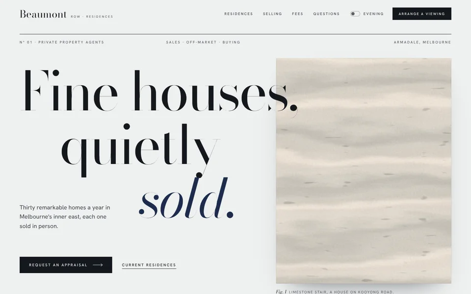
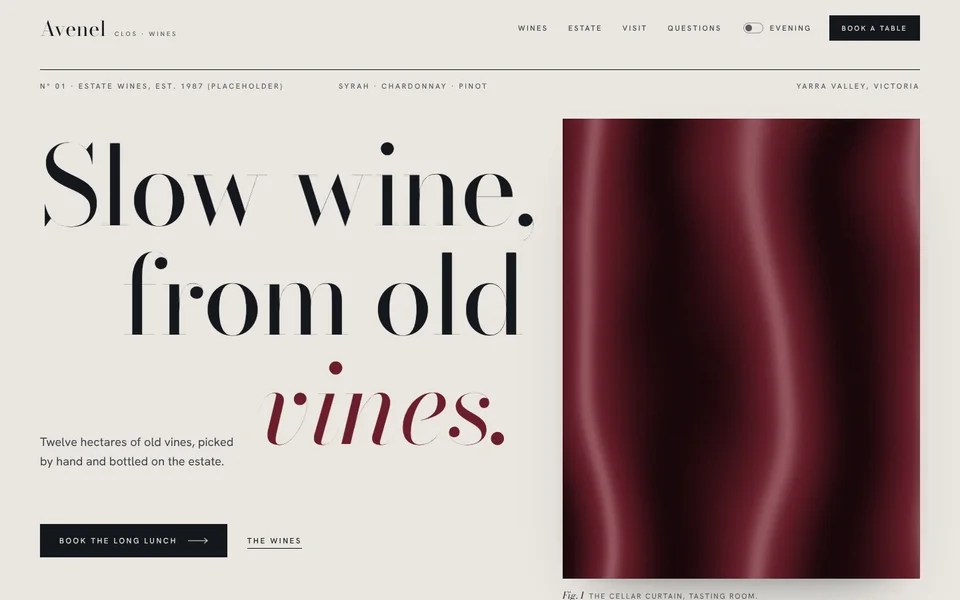
| Examples | examples/beaumont-row (boutique property agency), examples/clos-avenel (estate winery and dining room) |
| Tokens | tokens.css (canonical), tokens.json (generated) |
| Modes | Light (porcelain) by default; Evening dark mode from the system setting or the Evening switch in the nav and footer (remembered). The closing band is always evening. |
Best for
- Business types: boutiques and fashion labels, jewellers, residential real estate and property developers, architects and interior designers, law and private wealth firms, hotels and guesthouses, fine dining, wineries and distilleries, salons and fragrance houses.
- Audiences: people buying something considered and expensive, who judge a business by its taste before its claims; clients who value discretion over noise.
- Less suited to: products that need to be demonstrated (use Strata), offers that win on a number or a spec (use Signal), high-volume retail with dense catalogues, playful or loud brands, and anything that must feel cheap and cheerful.
Personality and voice
Restrained, confident, few words. Atelier never explains itself twice and never raises its voice. Short declaratives, concrete nouns, no superlatives.
- Headlines are two or three short lines, landing on one italic word: "Quiet rooms, made to last.", "Fine houses, quietly sold.", "Slow wine, from old vines.", "Rooms we still visit.", "Fees, in writing."
- Interludes state a single rule: "Fewer things, better made.", "The right buyer, not the most.", "Nothing hurried."
- Labels in tracked caps name things plainly: Selected work, The practice, The library, Approach, Fees, Questions, Enquiries.
- Captions in small caps, led by an italic Fig. number: "Fig. 1 Calacatta Viola, honed. Kitchen island, Linden House."
- Buttons: Begin a project, Enquire, Request an appraisal, Book a table, Arrange a viewing. Secondary actions are underlined text: View the work, The wines.
- Microcopy is factual and calm: "Every fee is agreed in writing before we draw a line." "Viewings are private and by appointment."
- Avoid: exclamation marks, "luxury", "bespoke solutions", "world-class", "elevate", "curated experiences", emoji, stacked adjectives, and any claim the customer can't back with a fact.
Colour
| Token | Light | Evening | Role |
|---|---|---|---|
--bg |
#f0f1ee |
#0e1115 |
Page. Cool porcelain, never cream. |
--paper |
#f8f8f6 |
#151920 |
Raised plates, hover fill on fee rows, the phone menu. |
--stone |
#e2e1dc |
#1b2028 |
Warm stone ground behind the materials library. |
--ink / --ink-2 / --muted |
#15181d / #3d4149 / #5c6068 |
#eceae4 / #c5c3bc / #9b9a94 |
Headlines and primary button; body; labels and captions. |
--rule / --rule-2 |
#cacbc6 / #9fa19b |
#2a2f37 / #464c55 |
Hairlines; stronger hairlines (switches, round buttons). |
--accent |
#1e4a3a bottle green |
#c8a66a brass |
The one accent: the italic word, chapter numerals, the button hover fill, switches. |
--accent-2 / --accent-soft / --on-accent |
#2c6650 / #dce4de / #f3f3ef |
#e0c48c / #2a251b / #121417 |
Hover, selection, text on accent. |
--velvet |
#1e4a3a |
#183a2e |
The cloth panel behind the interlude. Stays deep in both modes so ivory reads on it. |
--brass / --metal |
#a6834b / brushed brass gradient |
same | Metal, used sparingly: the closing italic and the round Enquire ring only. |
--marble --vein --travertine --oak --linen --plaster |
Calacatta, grey vein, travertine, oak, linen, limewash | Nero, pale vein, dark stone, smoked oak, dark linen, dark plaster | Material colours the canvas panels read. |
--evening / --evening-ink / --evening-muted |
#101318 / #edebe5 / #a7a59e |
#08090c / same |
The closing band, always dark. |
Contrast (WCAG, measured): ink on bg 15.7:1; ink-2 on bg 9.0:1 and on stone 7.8:1; muted on bg 5.6:1, on paper 5.9:1 and on stone 4.8:1; bottle green on bg 8.8:1 and on stone 7.7:1; on-accent on bottle green 9.0:1. Evening: ink 15.7:1; ink-2 10.7:1; muted 6.7:1 on bg and 5.8:1 on stone; brass 8.2:1 on bg and 7.1:1 on stone; dark text on brass 8.0:1. Closing band: evening-ink 15.6:1, evening-muted 7.5:1. Ivory on the velvet ground is 8.9:1; over the cloth's brightest sheen it stays above 3:1, so only large display type sits on velvet, over a darkening wash. Solid --brass on porcelain is 3.1:1, so it is never used for text in light mode.
Typography
- Bodoni Moda (Google Fonts) 400, roman and italic, optical size 6–96, for headlines, numerals, project names, prices, FAQ questions and the giant footer wordmark.
- Hanken Grotesk (Google Fonts) 300–600 for body copy, tracked labels, buttons and small-caps captions.
Why Bodoni Moda: it is a true Didone, the face of fashion mastheads, with an optical-size axis. At display sizes the browser picks its 96pt master, whose hairlines are almost thread-thin, so a regular weight set at 180px reads light and expensive rather than heavy; at small sizes it opens up and stays legible. Its italic is narrow and calligraphic, which gives each headline one exquisite turn. Playfair and Fraunces were considered and rejected: both are now common, and neither has Bodoni's needle contrast. Hanken Grotesk is a quiet neo-grotesk with open apertures that holds up at 11px with wide tracking.
| Use | Size | Weight | Tracking | Line height |
|---|---|---|---|---|
| H1 (hero) | clamp(46px, 11.4vw, 178px); phones clamp(44px, 13.6vw, 64px) |
400 | −0.03em | 0.9 |
| Closing and interlude | clamp(48px, 9vw, 150px) |
400 | −0.03em | 0.92 |
| H2 | clamp(40px, 6.2vw, 98px) |
400 | −0.025em | 0.96 |
| Chapter numeral | clamp(76px, 12vw, 196px), accent |
400 | −0.04em | 0.8 |
| H3 (project, service, fee) | clamp(24px, 2.3vw, 34px) to 44px |
400 | −0.015 to −0.02em | 1.05–1.1 |
| Lead | clamp(17px, 1.3vw, 19.5px), max 34ch |
400 | 0 | 1.6 |
| Body | 15.5px | 400 | 0 | 1.65 |
| Label | 11px uppercase | 500 | 0.24em | 1.5 |
| Caption | 15px all-small-caps, led by an italic Fig. in Bodoni |
400 | 0.12em | 1.5 |
The signature move: the hero headline is three short lines, each in its own mask, stepped in from the left (0, 10%, 30% of the measure) so the italic last line lands beside the lead paragraph, while the first line runs across the edge of the tall material panel. One <em> per headline, in the accent, always the last word or phrase. Masks carry padding: 0.1em 0.18em 0.17em with matching negative margins, so ascenders, descenders and the italic overhang are never clipped.
Layout
- Wrap 1320px; gutter
clamp(20px, 4.2vw, 60px). A 12-column grid with 24px column gaps, used asymmetrically. - Hero: a full-width hairline that draws itself, a row of three tracked labels, then the stepped headline across columns 1–11 overlapping a 4:5 panel in columns 8–12. The lead sits in the indent beside the italic line; buttons below; a hairline footer row with a scroll cue.
- Chapters: every section opens with a big accent numeral (columns 1–3), a label and H2 (4–9), and a short lead (10–12, bottom-aligned), closed by a hairline. On narrow screens they stack.
- Collection: a sideways scroller of project cards in two sizes (tall 4:5.3 and wide 5:4, the wide ones dropped lower), aligned to the wrap's left edge and bleeding off the right. Counter, progress hairline, round prev / next.
- Split: a sticky left column (numeral, H2, lead, a small panel with caption) beside a list of services with italic roman numerals and hairline rows.
- Library: six square material swatches on the warm stone ground, staggered up and down like a sample board.
- Interlude: a full-bleed velvet panel, about 86vh, with one rule set huge in ivory.
- Steps, notices, fees, questions: roman numerals across four columns; a big labelled sample quote beside placeholder press titles; fee rows as an editorial table; FAQ as hairline rows.
- Close: the evening band with a dark marble panel, a stepped headline, a round brass-ringed Enquire button and three details. Footer: the business name set giant, four columns, then switches.
- Spacing scale: 4, 8, 12, 16, 24, 40, 64, 96, 160, 220. Sections are 160px apart (104px on phones): generous whitespace is part of the look.
Shape
- Radii: none. Panels, plates, buttons and fee rows are square-cornered. The only round things are the circular buttons (prev / next and the Enquire ring), the switches and the cursor ring (
--r-round). Focus rings use 2px. - Borders: 1px hairlines in
--rule; the hero and step rules in full ink; a bottle-green hairline draws under a service row on hover. - Shadows:
--shadow-plateunder the hero panel (long, soft, low) and--shadow-liftunder swatches. Nothing else casts a shadow. - Metal: the brushed brass gradient (
--metal) appears only on the closing italic and the Enquire ring and its hover fill.
Motion language
Slow and expensive. Long durations, a single expo-out curve (cubic-bezier(0.16, 1, 0.3, 1)), nothing bouncy.
| What moves | How | Timing |
|---|---|---|
| Line-mask headlines (signature) | Each line rises out of its mask from 118% with a 2.5° tilt that straightens as it lands, 120ms apart. Hero on load; section headings, numerals, interlude and close as they enter. | 1.35s |
| Panels settle (signature) | The hero panel unveils upward (clip) while its material zooms from 1.22. Every [data-settle] panel scales its material from 1.12 to 1 as it travels up the viewport, eased and smoothed. |
1.8s load; scroll-linked |
| Collection | Native sideways scroll, plus mouse drag with inertia, smooth prev / next, a live counter and progress hairline, and parallax inside each card (the material drifts against the frame). | Continuous |
| Cursor ring | A 46px hairline ring (difference blend) trails the pointer; grows over links and reads Drag over the collection. Fine pointers only. | 0.16 follow |
| Magnetic buttons | Buttons, round buttons and the Enquire ring lean up to 16px toward the pointer; their labels move further. | 0.9–1s return |
| Hovers | Buttons fill from the bottom (ink → accent); text links retract and redraw their underline; service titles slide 10px; swatches lift and turn 0.6°; fee rows warm to paper. | 0.7–1.2s |
| Ambient | The hero rule draws itself; a scroll cue line travels; the closing brass italic slowly brushes across. | 2.2s, 2.8s loop, 10s |
Degrading. For customer sites the default follows prefers-reduced-motion; the footer Motion switch overrides it either way and is remembered (site-motion). With motion off, masks rest open, panels sit at full size, the cursor ring and magnetism switch off, loops stop and the collection still scrolls. Nothing waits on an animation to become visible, so no-JS, print and screenshots show the whole page. Materials are drawn once (and on resize or theme change), not every frame.
Imagery and illustration
- Materials are the imagery.
js/atelier.jsdraws seeded procedural surfaces into<canvas class="mat" data-mat="…" data-seed="…">:marble(veins with soft halos; Calacatta in light, Nero in evening),travertine(bedding and shallow voids),oak(warped growth rings and fibres),velvet(draped folds with sheen, in--velvet),linen(slubbed weave),plaster(limewash),brass(brushed). Each reads--m1/--m2/--m3from the material tokens, so a customer's palette recolours them. Changedata-seedfor a different slab of the same material. - Every panel has a caption in small caps with an italic Fig. number that names the material and where it is used, as a magazine would.
- Real photography, when the customer has it, goes inside the same square-cornered
.plateframes (withdata-settlefor the zoom), in long portrait or wide landscape crops, muted and evenly lit. Never stock, never people posing at the camera. - No icons beyond a hairline arrow. Numerals and rules do the work icons would.
- Logo: the name in Bodoni Moda at 31px beside a tracked descriptor (Studio · Interiors); the footer repeats it giant.
Signature components
- Stepped hero. Label row on a self-drawing hairline, three masked lines stepped in, italic last word in the accent, the lead in the indent, a tall settling panel with caption.
- Chapter header. Big accent numeral, label, two-line H2, short lead, hairline.
- Collection scroller. Tall and wide cards with parallax materials, N° numbers, names in Bodoni, small-caps details; counter, progress rule, round magnetic arrows; Drag cursor.
- Service list. Italic roman numerals, Bodoni titles that slide on hover, small-caps meta, an accent hairline drawing underneath.
- Materials library. Staggered square swatches on stone, each with name and finish.
- Velvet interlude. One rule, set huge in ivory over drawn cloth.
- Steps with large roman numerals under a drawn ink rule.
- Notices. A large italic quote clearly boxed Sample quote · placeholder, beside placeholder press titles set in contrasting styles.
- Fee table. Italic numeral, name, description, price in Bodoni, underlined action.
- FAQ as hairline rows with a thin plus that turns to a minus.
- Evening close with dark marble, brass italic and the round brass-ringed Enquire button; giant wordmark footer with the Evening and Motion switches.
Do and don't
Do
- Keep headlines to two or three short lines and end each on one italic word in the accent.
- Give every panel a caption, and let the first hero line cross the panel's edge.
- Leave the whitespace. If a section feels empty, make the type bigger, not the copy longer.
- Keep one accent. Use brass metal only on the closing italic and the Enquire ring.
- Keep square corners and hairlines everywhere.
- Let only ink lines cross a panel. If the hero panel is dark (velvet, Nero, oak), keep the accent italic off it (Clos Avenel narrows the indent on desktop and drops the overlap on phones).
Don’t
- Use cream (
#f4f1eaand its cousins) or a terracotta accent. Porcelain is cool; stone is grey. - Add a second accent colour, gradients on buttons, rounded cards or drop shadows on text.
- Set body copy or labels in Bodoni, or headlines in the grotesk.
- Put two italics in one headline, or italicise a whole line.
- Use stock photography or icon grids. Materials, numerals and rules are the illustration.
- Present the sample quote or placeholder press titles as real. Label them until the customer supplies real ones, with permission.
- Key motion off
prefers-reduced-motiononly: always keep the Motion switch.
Accessibility
- Contrast as measured above; muted text passes AA on every ground it sits on, including the stone library.
- Canvases are
aria-hidden; each panel's meaning is in its visible caption (<figure>/<figcaption>). Decorative numerals arearia-hidden; headings carry the meaning. - The collection is a focusable
role="region"with a label, so arrow keys scroll it; prev / next are labelled buttons and disable at the ends. Touch scrolls natively with snap. - Evening and Motion are
role="switch"buttons witharia-checked; the nav's Evening label is visually hidden on narrow screens but stays in the accessible name. The phone menu is a labelledaria-expandedbutton; Escape closes it and returns focus. - Visible focus: a 1px ink outline at 4px offset with an accent halo. Skip link first. The nav reappears whenever it receives focus.
- The cursor ring is decorative, never replaces the system cursor, and exists only for fine pointers with motion on.
- No horizontal scroll at 360px; the hero stacks with the panel tucked under the italic line.
How to make it yours
| Dial | What you can change | Rules |
|---|---|---|
| Accent | --accent, --accent-2, --accent-soft, --velvet |
One rich, deep colour: bottle green (Orsel), deep navy (Beaumont Row), oxblood (Clos Avenel), aubergine, ink blue. 7:1 or better on the ground. --velvet usually matches it. |
| Evening accent | --accent in the dark blocks |
Brass by default; champagne (Clos Avenel) or pale gold are fine. Always metallic in feel, AA on deep ink. |
| Ground | --bg, --paper, --stone, --rule |
Cool porcelain (default, Beaumont Row slightly cooler) or warm stone grey (Clos Avenel #e9e6e0). Never cream, never pure white. |
| Materials | --marble, --vein, --travertine, --oak, --linen, --plaster, and which data-mat each panel uses |
Choose the customer's own materials: Carrara for a cool brand, Calacatta for warmth, oak for a cellar. Evening needs dark versions. |
| Headline steps | .ln-2 / .ln-3 indents |
Keep the staircase; adjust so the italic stays off a dark panel. |
| Sections | Which chapters appear and their order | Hero first, evening close last; renumber the chapter numerals. |
| Logo | Name in Bodoni beside a tracked descriptor, or the customer's mark | Keep it small in the nav and giant in the footer. |
| Not negotiable | Bodoni Moda + Hanken Grotesk, the stepped masked headline with one italic, captioned material panels that settle, hairlines and square corners, one accent, the evening close, the Motion switch | These are what make it Atelier. |