STYLE.md · Crafted · alive · composed
How Strata works. Every rule, written down.
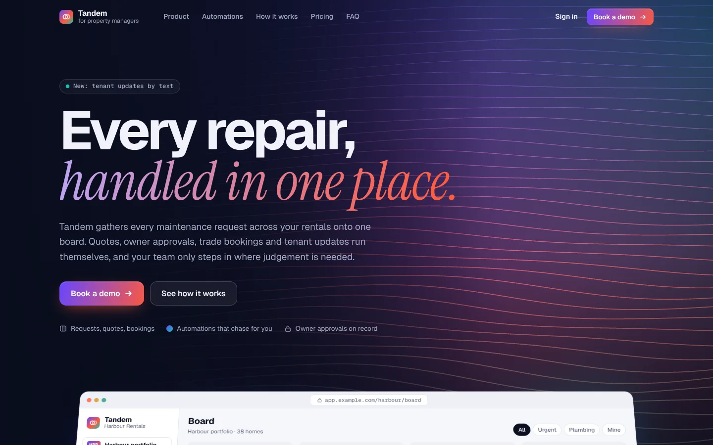
Strata opens on a deep navy band where dozens of fine lines drift like a part being printed one layer at a time, coloured by depth from violet through coral to aqua. A huge, tightly set headline breaks into a serif-italic phrase with a slowly drifting sheen. Below the band, the page turns calm and light, and the product appears as real, working vignettes: a board where a card lifts and lands in the next column, a thread that types itself, a status track with a travelling pulse. Motion is everywhere but never loud.
Derived from the Mojo Desk landing page and app. Templates contain no Mojo branding.
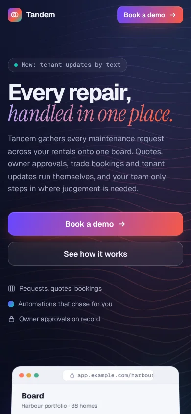
| Template | template/index.html (Tandem, fictional maintenance software for property managers) |
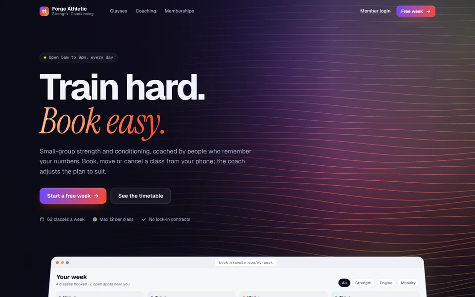
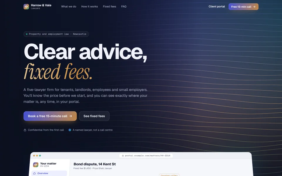
| Examples | examples/forge-athletic (gym), examples/harrow-vale (law firm) |
| Tokens | tokens.css (canonical), tokens.json (generated) |
| Modes | Light working surfaces by default, full dark mode from the system setting. The hero, automation band and closing band are always night. |
Best for
- Business types: SaaS and apps, platforms and portals, service businesses with a process to show (clinics, law firms, agencies, property managers, logistics), studios and gyms with booking flows, anything with a product UI or a journey worth animating.
- Audiences: buyers who want to see how it works before they talk to anyone; teams choosing a tool; clients who value calm and competence.
- Less suited to: single-page brochures with nothing to demonstrate, or very traditional brands that shouldn't move at all.
Personality and voice
Warm, capable and specific. Strata explains how things work in the customer's own words and lets the vignettes prove it.
- Headlines are short and land on the italic phrase: "Every repair, handled in one place.", "Train hard. Book easy.", "Clear advice, fixed fees.", "Nothing is closed until the tenant says it's fixed."
- Closing lines are a three-beat rhythm: "Report it. Fix it. Prove it.", "Ask it. Settle it. Move on."
- Eyebrows in mono caps name the section plainly: On the board, Automations, How jobs move, Pricing.
- Vignette copy is realistic and particular: names, times, amounts. "Owner approved the $640 quote. Plumber booked for Thursday 9am."
- Buttons: Book a demo, Start a free week, Book a free call, See pricing. The primary is the violet→coral gradient; the secondary is glass on night, outline on day.
- Avoid: generic "streamline your workflow" lines, fake metrics, stock dashboards with lorem ipsum.
Colour
| Token | Light | Dark | Role |
|---|---|---|---|
--bg |
#f5f6fa |
#080b15 |
Page. |
--surface |
#ffffff |
#0f1326 |
Tiles, frames, cards. |
--sunk |
#eef0f6 |
#0b0f1f |
Wells inside tiles, board columns. |
--ink / --ink-2 / --muted |
#0b1020 / #3a4157 / #646b82 |
#eceef8 / #c2c7da / #8b92ad |
Text, three levels. |
--line / --line-2 |
#e3e6ef / #d2d7e3 |
#1c2240 / #2a3154 |
Borders. |
--violet |
#6847ff |
same | Triad, cool. Lines, gradient button start, glows. |
--coral |
#ff5a3c |
same | Triad, warm. Gradient button end, sheen, the return loop. |
--aqua |
#10c4b4 |
same | Triad, fresh. Deepest lines, live dots, blobs. |
--accent / --accent-soft |
#5a3cf4 / #efebff |
#9381ff / #1b1840 |
Links, focus, eyebrows, selected states. |
--ok / --warn / --bad (+ -soft) |
#109a6a / #d98e0b / #e0434a |
#39c98f / #f0b24a / #ff6b70 |
Status pills and track colours. |
--hero / --hero-lift |
#090d1d / #161c40 |
#060914 / #121733 |
Night bands and their lit corner. |
--hero-ink / --hero-muted |
#f1f2fa / #a3a9c4 |
same | Text on night. |
--sheen |
#b7a8ff → coral → #ffc36b |
same | The italic gradient on night. |
--sheen-light |
accent → coral |
same | The italic gradient on day. |
Contrast (WCAG): ink on bg 17.5:1; muted on bg 4.9:1, on surface 5.3:1 and on sunk wells 4.65:1 (the source's #6a7188 was nudged darker to get there); accent on white 6.2:1; hero-muted on night 8.3:1; dark-mode muted 6.4:1 and accent 6.0:1. Status pill text is mixed toward ink (warn 5.9:1, ok 5.2:1 on their soft fills), an improvement on the source, whose raw amber on cream was 2.4:1.
Typography
- Geist (Google Fonts) 400 / 500 / 600 / 650 / 700 for UI and headlines.
- Geist Mono (Google Fonts) 500 for eyebrows, keys, URLs, logs and pills.
- Instrument Serif italic (Google Fonts) 400 for the emphasised phrase in headlines only.
| Use | Size | Weight | Tracking | Line height |
|---|---|---|---|---|
| H1 (hero) | clamp(46px, 7.6vw, 112px) |
650 | −0.05em | 0.93 |
| Closing headline | clamp(42px, 7vw, 100px) |
650 | −0.048em | 0.95 |
| H2 | clamp(36px, 5.2vw, 66px) |
650 | −0.044em | 1 |
| Tile title | 20px | 650 | −0.02em | 1.25 |
| Lead | 18px (hero clamp(16px, 1.45vw, 19px)) |
400 | 0 | 1.6 |
| Body | 15px | 400 | 0 | 1.55 |
| Eyebrow | 12px mono uppercase | 500 | 0.08em | 1 |
The signature move: the <em> in a headline switches to Instrument Serif italic 400 with a gradient sheen that drifts over 9 seconds. It needs padding: .08em .16em; margin: 0 -.16em and box-decoration-break: clone so the italic overhang is never clipped. One <em> per headline, always at the end or the turn of the sentence.
Layout
- Wrap 1200px with 24px gutters (16px on phones).
- Hero band: 160px top padding, 340px bottom padding, left-aligned, max 11.5ch headline. The lines canvas fills the band and fades toward the text side.
- Product frame overlaps the band by 280px, tilted back 14° in perspective; it flattens as you scroll the first 560px. Floating cards hang off its corners.
- Sections are 116px apart. Headers: eyebrow, H2, lead (max 60ch). Centre them for "how it works" and pricing; left-align elsewhere.
- Bento: a 6-column grid of tiles spanning 4 + 2, 2 + 2 (+ a tall 2), 3 + 3. Collapses to 2 columns at 1080px and 1 at 760px.
- Night band mid-page (automations, agents, a showcase) with drifting strata lines, a console on the left and a live panel on the right, then four points.
- Flow track: five nodes on a line with a travelling dot and a dashed return loop above.
- Spacing scale: 4, 8, 12, 16, 24, 32, 48, 64, 116, 160.
Shape
- Radii: 999px chips and pills; 6px tags; 10–12px buttons; 11px board cards; 14px columns and blocks; 16px vignette wells; 18px frames and consoles; 20px panels and FAQ items; 24px tiles and plans.
- Borders: 1px
--line;--line-2on hover and on open details. - Shadows:
--shadow(resting),--shadow-lg(lifted, floats),--shadow-frame(the product frame, with a violet under-glow). - Gradient rule: a 3px violet → coral → aqua strip on top of the featured plan and message cards.
- Glass only on night: buttons, pills and the nav once scrolled (blur 14px, saturate 1.4).
Motion language
Motion is on by default and real, with one rule: it shows how the product behaves.
| What moves | How | Timing |
|---|---|---|
| Print-layer lines (signature) | Canvas, 36–50 lines, each a sum of two sine waves, thicker and brighter with depth, over three additive colour fields. Paused off-screen. | Continuous |
| Italic sheen | Gradient position drifts back and forth. | 9s ease-in-out, alternate |
| Hero load | Each line of the hero rises 18px out of an 8px blur, 90ms apart; the frame rises 60px after 350ms. | 1s / 1.3s cubic-bezier(.2,.8,.2,1) |
| Scroll reveal | Elements not on screen at load rise 28px from a 7px blur and 0.985 scale when first seen. | 0.95s, 110ms stagger |
| Frame tilt | 14° → 0° over the first 560px of scroll. | Scroll-linked |
| Board loop | A card lifts, tilts 2.6°, travels to the next column and lands while slots open and close (a CSS FLIP loop); the status pill swaps. | 9s loop |
| Vignettes | Typewriters, a search that types, a pressed result button, a spinning sync icon, a drawn sparkline, an audit log that slides in, a status track pulse. | 3–8s loops, started when visible |
| Ambient | Drifting glows (18–22s), the floating cards bob (9–10s), live dots ping (2.4s), strata lines scroll on night bands (10s). | Slow |
| Hover | Tiles lift 4px with a larger shadow; a pointer-following violet glow inside tiles; button arrows nudge 3px. | 0.45s / 0.3s |
Degrading. For customer sites the default follows prefers-reduced-motion; the footer Motion switch overrides it either way and is remembered. With motion off, the canvases draw one still frame, loops rest on their most informative state (the moved card in place, the result pressed, the full log shown), reveals don't play and the frame sits flat. Nothing is ever hidden waiting for an animation, so screenshots, print and no-JS all show the full page.
Imagery and illustration
- The product is the illustration. Build vignettes from HTML and CSS using the customer's real nouns: their jobs, classes, matters, orders. They animate, scale crisply and translate.
- Avatars are gradient discs with initials, never stock faces.
- Photos, when needed, sit inside tiles (16px radius) or as small gradient placeholders like the job photos in the template.
- Icons: 1.4px line icons at 15–18px; on night, inside a gradient square (
.point-ic). - Logo: a 28px rounded square with the triad gradient holding a white mark, beside a two-line wordmark.
Signature components
- Layer band. Night hero with the lines canvas, a mono pill with a live dot, the H1 with its italic sheen, lead, gradient + glass buttons and a row of facts.
- Product frame. Browser chrome with a mono URL, a sidebar app and a board whose card moves column to column; tilts in perspective; floating queue and chat cards.
- Bento tiles with live vignettes: filterable list, full-page record, docs with sync status, playbook search, thread, report with KPIs and sparkline.
- Night band with strata lines, a console of rules and an activity log that plays step by step, a live panel that lights up in step, and four gradient-icon points.
- Flow track with travelling pulse and a dashed return loop.
- Proof split: placeholder logos and labelled sample quotes on the left; a message thread and a dark audit log overlapping on the right.
- Plans with mono kicker, big tabular price, check list; the pick has the gradient strip.
- FAQ as rounded
<details>with a plus that turns into a minus on a spring. - Closing band with lines and a three-beat headline; footer with the Motion switch.
Do and don't
Do
- Keep the night bands for the hero, one mid-page band and the close; keep everything between them calm and light.
- Show the customer's actual product or process in the vignettes, with realistic names and numbers.
- End one phrase per headline in the serif italic.
- Start loops only when they're on screen, and let them rest on a meaningful frame.
Don’t
- Put the italic serif in body copy or use two italics in one headline.
- Add a fourth accent, or let the coral and aqua touch directly in a gradient (they turn grey-brown; go through violet or a neutral).
- Fill the bento with icon-and-paragraph cards. Every tile needs a vignette.
- Present sample quotes as real testimonials. Label them until real ones, with permission, replace them.
- Key motion off
prefers-reduced-motiononly: always provide the switch as well.
Accessibility
- Contrast as listed above; status pills mixed toward ink to meet AA.
- Decorative canvases and vignettes are
aria-hidden; the product frame has arole="img"with a plain description. - Real controls in vignettes (filter chips) are buttons with
aria-pressed; FAQ uses native<details>. - Visible focus: 2px accent outline, 3px offset. Skip link first.
- Typewriters reserve their full text's space (ghost text), so nothing reflows while typing; with motion off they show the whole sentence.
- No horizontal scroll at 360px; the frame simplifies to two columns and the floats tuck in on phones.
How to make it yours
| Dial | What you can change | Rules |
|---|---|---|
| Triad | --violet, --coral, --aqua |
One cool, one warm, one fresh, all saturated. Electric violet / hot red / volt (Forge); ink indigo / brass / teal (Harrow & Vale). |
| Night | --hero, --hero-lift |
Very dark and slightly blue or purple; never pure black, never grey. |
| Sheen | --sheen, --sheen-light |
Light-to-warm-to-light on night (it must read on navy); accent → warm on day. |
| Accent | --accent, --accent-soft |
Usually a slightly deeper version of the cool triad colour; AA on white. |
| Lines | data-lines (36–50) and data-start (where they reach full strength) on each canvas |
Fewer, calmer lines for quieter brands (Harrow & Vale uses 40 at 0.38). |
| Vignettes | Everything inside the frame and the tiles | Real domain nouns, realistic data, one clear motion each. |
| Logo | Any white mark in the gradient square, or the customer's logo | 28px; wordmark with a short descriptor underneath. |
| Not negotiable | Night bands with lines, Geist + Instrument Serif italic sheen, calm light surfaces between, product-as-illustration, the Motion switch | These are what make it Strata. |