STYLE.md · Loud · physical · rhythmic
How Marquee works. Every rule, written down.
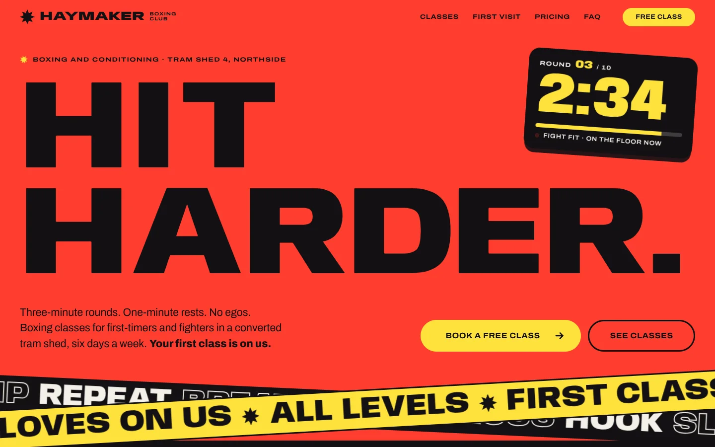
Marquee is a poster you can scroll. Every section is one flat, saturated block (electric red, cobalt, acid yellow, ink) and the type fills it edge to edge. The display face has live width and weight axes, so headlines squash narrow as you scroll fast and flinch thin where the pointer comes near, letters inflate one by one as they arrive, and tickers of huge solid and outline words run across the page, speeding up and reversing with your scroll. Class cards stack and slide over each other, a big number counts up, and buttons lean toward the cursor and squish when pressed. It is the opposite of calm, on purpose, and it still parks on a readable frame the moment someone turns motion off.
Templates contain no Mojo branding.
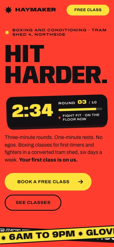
| Template | template/index.html (Haymaker, a fictional boxing and conditioning gym) |
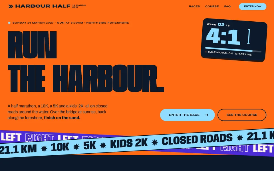
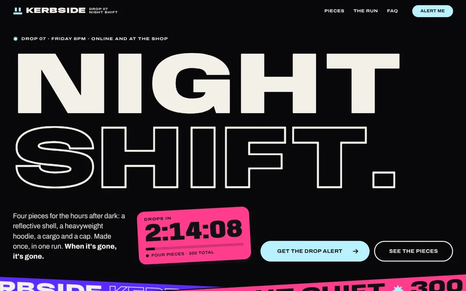
| Examples | examples/harbour-half (city half marathon), examples/kerbside (streetwear drop, Night variant) |
| Tokens | tokens.css (canonical), tokens.json (generated) |
| Modes | One look: the colour blocks are the theme. An opt-in Night variant (<html data-theme="dark">) darkens the quiet grounds for after-dark brands. It never follows the system setting. |
Best for
- Business types: gyms, boxing and fitness studios, music venues and festivals, sports clubs and race events, streetwear and sneaker drops, energy drinks and snacks, events and launch campaigns, youth brands.
- Audiences: people who decide on feel in a second and act on impulse: on a phone, on the way somewhere, with friends. Fans more than evaluators.
- Less suited to: anything that needs trust through restraint (law, health, finance), long reading, dense comparisons or a product UI to show. Brands whose customers are anxious or in pain. If the honest mood is "calm", this is the wrong style.
Personality and voice
Short, shouty, rhythmic. Say it like a coach between rounds: verbs first, two to four words a line, a full stop for punch. Body copy is plain and friendly and does the explaining the headlines refuse to.
- Headlines: "Hit harder.", "Pick your fight.", "No contracts. No excuses.", "Run the harbour.", "Night shift.", "Made once.", "Don't miss it."
- Closing lines are two beats with a full stop each: "First class. On us.", "See you at the start."
- Tickers are chants: three to six beats that repeat well. "Jab · Cross · Hook · Slip", "Left · Right · Breathe · Finish", "Drop 07 · Night shift · 300 pieces · No restock". Alternate solid and outline words.
- Labels in extended caps say the facts: 45 min · Level 1 · No contact, Gun 6:30 · Cut-off 3h30.
- Buttons: Book a free class, Enter now, Get the drop alert, See classes. Verbs, never "Learn more".
- Microcopy: "Your first class is on us.", "When it's gone, it's gone.", "Placeholder figures. Replace with the gym's real timetable."
- Avoid: long headlines (more than about six words), questions as headlines, exclamation marks (the type already shouts), "unleash", "elevate", "next level", "beast mode", and anything that shames bodies.
Colour
Four saturated blocks plus one quiet ground. Each block carries exactly one ink and one pop colour; components read --bg, --fg, --pop, --pop-fg from the block class (.on-red, .on-blue, .on-yellow, .on-ink, .on-chalk) and never hard-code a colour.
| Token | Day | Night | Role |
|---|---|---|---|
--red / --on-red |
#ff3d2e / #121013 |
same | Hot block: hero, pricing, a card. Ink on red, never white (3.5:1). |
--blue / --on-blue |
#1d34ff / #f3efe6 |
#1424c8 / #f3efe6 |
Cool block: counter, cards, plans. |
--yellow / --on-yellow |
#ffe23d / #121013 |
same | Loud block: tapes, how it works, the close. |
--ink / --on-ink |
#121013 / #f3efe6 |
#09080b / #f3efe6 |
Black block: section intros, proof, footer, the clock. |
--chalk / --on-chalk |
#f3efe6 / #121013 |
#1a181e / #f3efe6 |
The one quiet ground: FAQ, a stack card. At most twice a page. |
--pop-red / -blue / -ink |
--yellow |
same | Buttons, the counter, outlines and marks on those blocks. |
--pop-yellow |
--ink |
same | Buttons on yellow. |
--pop-chalk |
--red |
--yellow |
Button fills on chalk (ink text). |
Contrast (WCAG 2.x, measured): ink on red 5.37:1; chalk on blue 6.13:1; yellow on blue 5.42:1; ink on yellow 14.6:1; chalk on ink 16.5:1; yellow on ink 14.6:1; ink on chalk 16.5:1. Button text: ink on yellow 14.6:1, yellow on ink 14.6:1, ink on red 5.37:1. Night: chalk on deep blue 8.65:1, yellow on deep blue 7.65:1, chalk on night chalk 15.3:1, chalk on night ink 17.4:1. Never pair: red on chalk (3.07:1, display type over 40px only), red on yellow (2.72:1), red on blue (1.99:1), white on red (3.52:1). There are no greys: secondary text is the same ink at a smaller size, never a lighter tint.
Typography
- Anybody (Google Fonts), variable, width 50–150 and weight 100–900, for every display line, ticker, number and price. Chosen because it has the widest combined range of the candidates: one family runs from a needle-thin condensed letter to a fat extended slab and stays legible at both ends, so squash and stretch read as the same letter moving. Big Shoulders and Unbounded only move weight, Bricolage Grotesque's width axis stops at 75–100, and Climate Crisis has a single novelty axis.
- Archivo (Google Fonts), variable, width 62–125 and weight 400–800, for body, labels and buttons. Same elastic logic at reading sizes: labels set extended (width 125), button labels widen and fatten on hover.
| Use | Size | Axes (wdth / wght) | Line height | Notes |
|---|---|---|---|---|
| H1 (hero, close) | fitted: the widest line fills the wrap (fallback clamp(64px, 15.6vw, 236px)) |
rest 118 / 860 | 0.84 | Uppercase, explicit lines (.ln). On phones lines wrap by word and the widest word is fitted. |
| H2 | clamp(48px, 9vw, 140px) |
118 / 860 | 0.84 | Max 12ch. Shrinks if one word is wider than its column. |
| Card name | fitted to one line, capped at max(96px, 26vh) |
128 / 900 | 0.84 | Fills the card edge to edge. |
| Counter | clamp(160px, 38vw, 560px) |
128 / 900 | 0.76 | In the pop colour. Shrinks to its row. |
| Ticker | clamp(56px, 9vw, 132px); tapes clamp(30px, 4.2vw, 64px) |
112 / 880 | 1 | Alternating solid and outline words. |
| Small display (h3, facts, step titles, prices) | 34–116px | 104–140 / 860–900 | 0.8–0.84 | |
| Lead | clamp(18px, 1.6vw, 22px) Archivo |
96 / 400 | 1.42 | Max 44ch. |
| Body | 16px Archivo | 100 / 400 | 1.5 | |
| Label | 12.5px Archivo caps, +0.09em | 125 / 700 | 1.2 | |
| Button | 13–20px Archivo caps, +0.03em | 108 / 700 → 125 / 850 on hover | 1 |
Display widths are offsets from one dial, --fs-wdth-rest (118): card names and the counter are +10, h3 −14, tickers −6, and phones pull every rest width about 40% of the way toward condensed. The live range is --fs-wdth-squash (58) and --fs-wght-squash (380).
The signature move: letters are live. [data-split] headlines are split into letters (screen readers get the sentence once); [data-flex] letters squash toward --fs-wdth-squash with scroll speed and go thin and narrow near the pointer, like a boxer slipping a punch; [data-fit] sizes the widest line to the container at rest, so every dynamic state is narrower than rest and nothing ever overflows. On entrance, letters inflate from width 50 / weight 120 one after another.
Layout
- Wrap 1360px with 28px gutters (16px on phones). Content hugs the left edge; display type spans the full wrap.
- Blocks are full bleed, edge to edge, square, one colour each. Never put a block colour in a card on the same block colour; never put two of the same block next to each other.
- Nav is 68px, fixed, and takes the colours of whichever block is under it.
- Section rhythm (template): red hero → tapes straddle the seam → ink intro with stacked cards (yellow, blue, red, chalk) → blue counter → yellow steps → ink proof → red pricing → chalk FAQ → yellow close → ink footer.
- Hero: kicker label, fitted two-line H1 with a short first line, the live clock hanging in the space that first line leaves (or in the hero foot when both lines are long), then lead + buttons, then two crossed tapes overlapping the next block by 96px.
- Stacked cards: each is at least the viewport tall, sticky at 68px; the covered card shrinks to 0.94 and dims as the next slides over. Inside: number and label row, a fitted name, then body copy left and facts, chips and a button right.
- Spacing scale: 4, 8, 12, 16, 24, 32, 48, 72, 120, 168. Sections are 120px tall at the top and bottom (72px on phones).
- Grids: three plans, three quotes, three steps, four facts; one column under 860px (facts go to two).
Shape
- Blocks and tapes: square, always.
- Radii: 999px buttons, chips, the sticker and the Motion switch; 28px stacked cards (top corners only) and plans; 22px the clock; 14px quotes and placeholders.
- Borders: thick and in the block's ink: 2–4px
currentColorfor outline buttons, time chips, FAQ rules and fact rules. No hairlines. - Shadows: two only.
--shadow-card, a soft shadow above a stacked card as it slides over the one beneath;--shadow-sticker, a hard 10px drop in ink under the clock, the featured plan and stickers. - No gradients, glass, blur or texture. Flat colour does the work.
- Tilt: stickers, the clock, quote cards and tapes sit 1.5–4° off square. Everything else is straight.
Motion language
Motion is on by default and physical: things have speed and weight, and they react to the visitor.
| What moves | How | Timing |
|---|---|---|
| Live letters (signature) | Per-letter font-variation-settings: width squashes with scroll speed; width and weight drop near the pointer (fine pointers only). |
Every frame while scrolling or pointing; idle otherwise |
| Tickers (signature) | One readable run cloned to fill; translate3d loop at 38–70px/s. Scroll speed multiplies it up to 8×, scroll direction reverses it, speed adds up to 8° of skew. |
Continuous while visible |
| Split-letter entrance | Each letter rises 0.42em from width 50 / weight 120, 28ms apart. Hero on load; others the first time they scroll in. | 0.9s cubic-bezier(.2,.9,.1,1) |
| Stacked cards | Sticky; the covered card scales to 0.94 and a black veil fades to 28%. | Scroll-linked |
| Counter | Counts up with an exponential ease while each digit widens from 50 to rest. | 1.6s, once |
| Live clock | Counts down for real (round timer, start-wave board, drop countdown); the last digit pops on each tick. | 1s steps |
| Buttons | Magnetic: lean up to 16px toward the pointer (translate). Squishy: scale: 1.07 0.88 on press, springing back. Label widens and fattens on hover. |
0.55s spring / 0.08s press |
| Reveals | Blocks rise 56px from transparent when first seen (not if already on screen at load). | 0.8s, 90ms stagger |
| Ambient | The kicker burst spins (9s), the sticker wobbles (3.2s), round bars fill in turn (6s), the clock's dot blinks. | Slow |
Only transform, opacity and font-variation-settings ever animate, all from one requestAnimationFrame loop that sleeps when nothing visible needs it. IntersectionObserver pauses tickers, letters, clocks and round bars off-screen.
Degrading. The default follows prefers-reduced-motion; the footer Motion switch overrides it either way and is remembered (localStorage "site-motion"). With motion off: tickers park on their first run with a whole word at the screen's left edge, letters sit at rest, entrances and reveals don't play, the clock stops on its starting time, the counter shows its number, cards stack without shrinking and buttons stop leaning. Nothing is ever hidden waiting for an animation, so screenshots, print and no-JS all show the full page.
Imagery and illustration
- Type is the picture. A Marquee page should work with no photos at all: the fitted headline, the tickers and the counter are the visuals.
- Vignettes are domain objects made of type: the round timer, a start-line wave board, a drop countdown, round bars. Build them from the business's real numbers.
- Photos, when a brand needs them (products, the venue), sit inside a block as a full-bleed panel or a cut-out on the flat colour; never a photo behind text. Until the real ones arrive, use the striped, labelled placeholder (
.phin Kerbside). - Icons are few and solid: the burst, the arrow, the plus, the tick. Square caps, 2.6–3px strokes.
- Logo: a solid mark in the pop colour beside an extended (width 150, weight 900) uppercase wordmark, with an optional two-line descriptor in labels.
Signature components
- Fitted hero. Kicker, a two-line live headline fitted to the wrap, a tilted live clock, lead, a pop button and an outline button.
- Crossed tapes. Two tickers rotated −3° and +2.6°, one solid on yellow, one alternating solid and outline on ink, crossing the seam into the next block.
- Stacked cards. Full-bleed, viewport-tall, sticky, sliding over each other: number, label, fitted name, copy, facts, chips, button.
- Big counter. One huge number in the pop colour, a short display line beside it, four ruled facts, and a placeholder note until the numbers are real.
- Steps with huge outline numerals that squash on hover.
- Proof as a giant ticker over three tilted quote cards in three block colours, each labelled Sample quote until real ones replace them.
- Plans as block-coloured cards with a huge price; the pick is lifted with a hard drop shadow and a wobbling sticker.
- FAQ on chalk with thick rules and a plus that springs to a cross.
- Close with an ink ticker, a fitted two-beat headline and an extra-large magnetic button; ink footer with the Motion switch.
Do and don't
Do
- Fill blocks edge to edge, one ink each, and change block on every section.
- Write headlines of two to six words that fit on two lines, with a short first line.
- Keep tickers to chants that make sense in any order, and alternate solid and outline words.
- Use the business's own numbers in the counter and the clock, labelled as placeholders until they're real.
- Let letters react only through width and weight: they never change position, colour or font.
Don’t
- Use white text on the red block (3.5:1), or red text on anything but display type over 40px on chalk.
- Add gradients, glass, blur, drop shadows other than the two tokens, or grey text.
- Put essential information only in a ticker or only in outline type: tickers repeat what the page already says.
- Animate layout properties (
top,width,margin) or colour. Only transform, opacity and font axes move. - Remove the Motion switch or key motion only off
prefers-reduced-motion. - Present sample quotes or placeholder figures as real.
Accessibility
- Contrast as measured above; each block's ink is AA on its ground, buttons are AA, and there are no tints.
- Split headlines keep the sentence in a visually hidden span; the letter copy is
aria-hidden, so a screen reader hears "Hit harder." once. - Tickers: the first run is real text, read once; every clone is
aria-hidden. Tickers carry slogans, never the only copy of a fact. - The clock is
role="img"with a plain label; the counter has its final number in a hidden span. - Visible focus: a 3px outline in the block's ink, 4px offset, on every link, button, summary and the switch. Skip link first. FAQ uses native
<details>. - Vestibular care: skew is capped at 8°, squash only happens while the visitor is scrolling, and the Motion switch stills everything. Default follows the reduced-motion setting.
- Tickers clip inside their block, so they never cause horizontal scroll; no overflow at 360px. Sticky cards turn off on screens shorter than 620px so nothing is trapped under the next card.
How to make it yours
| Dial | What you can change | Rules |
|---|---|---|
| Blocks | --red, --blue, --yellow, --ink, --chalk and each --on-* ink |
Three or four saturated flat colours plus ink: one hot, one cool, one light and loud. Measure every ground with its ink (AA 4.5:1). Tangerine / ultraviolet / sky / navy (Harbour Half); hot pink / violet / ice on night (Kerbside). Avoid the "near-black with one acid-green pop" cliché. |
| Width dial | --fs-wdth-rest (50–150), --fs-wdth-squash, --fs-wght-rest, --fs-wght-squash |
Condensed and tall (84) for sport and racing; extended and fat (146) for fashion and nightlife; 118 by default. Squash at least 30 below rest so the motion reads. |
| Night | <html data-theme="dark"> plus your block overrides inside :root[data-theme="dark"] |
For venues, clubs and drops that live after dark. Dark relief grounds, the lights stay saturated. Opt-in only. |
| Tickers | Copy, data-speed (px/s), data-dir (1 or −1), which block they sit on |
Chants, solid/outline alternating; 38–70px/s at rest. |
| Clock | data-clock (start seconds), data-cycle, [data-round] and data-of, label copy |
A real countdown from the domain: round timer, start waves, a drop, doors open. |
| Counter | data-count (integers or one decimal) and its line |
A real, sourced number, or labelled as a placeholder. |
| Sections | Order, which appear, card count | Hero first, close last; never two same blocks in a row; chalk at most twice. |
| Logo | Mark and wordmark | Solid mark in the pop colour; extended uppercase wordmark. |
| Not negotiable | Full-bleed flat colour blocks with one ink each, Anybody's live width and weight axes, scroll-steered tickers, the fitted headline, transform/opacity/font-axes-only motion, the Motion switch | These are what make it Marquee. |