STYLE.md · Inky · cheeky · neighbourly
How Riso works. Every rule, written down.
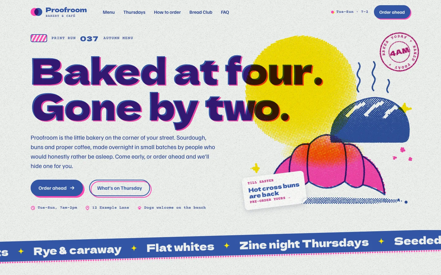
Riso is a risograph print shop on screen. The page is uncoated stock: a cool off-white with a fine paper speckle, never cream. Everything on it is printed in two or three flat spot inks that overprint each other (mix-blend-mode: multiply), so a blue headline running into a yellow sun turns deep brown and a pink croissant under blue line art goes violet. Illustrations are real halftones: greyscale SVG plates that the page screens into dots, one angle per ink. Headlines carry a second impression of themselves in the other ink, a few pixels off. On load and as you scroll, every plate starts out of register and slides into place. Stickers peel, ticket stubs tear, a drum stripe of type runs across the page and the print-run counter rolls.
Templates contain no Mojo branding. Every image is drawn with SVG, CSS and canvas: no photos, no image files.
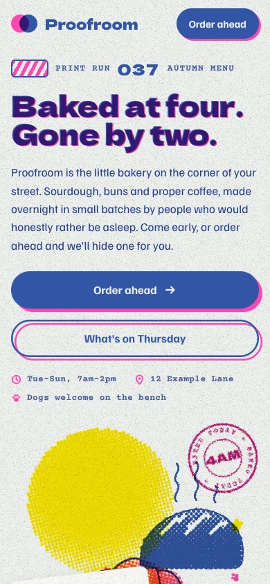
| Template | template/index.html (Proofroom, a fictional neighbourhood bakery and café with Thursday events) |
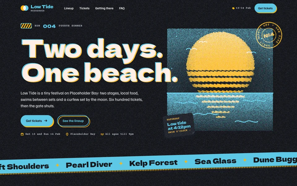
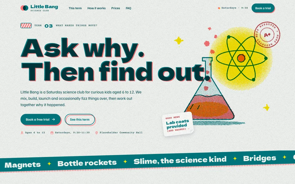
| Examples | examples/low-tide (small beach music festival, night run), examples/little-bang (kids' Saturday science club) |
| Tokens | tokens.css (canonical), tokens.json (generated) |
| Modes | Paper (light) is the website default and does not follow the visitor's system setting. Night run is an opt-in edition on black stock: <html data-theme="dark">. Use it for a whole brand (bars, late events, festivals), not as a per-visitor toggle. |
Best for
- Business types: cafés and bakeries, bars, events and festivals, community organisations and halls, bookshops, record stores, creative workshops and print studios, kids' programs and clubs, local makers and markets, zines and small publishers.
- Audiences: locals and regulars; families; people who choose a place because it feels like somebody's, not something's; anyone who likes a flyer on a noticeboard.
- Less suited to: finance, legal, health and anything that has to feel clinical or institutional; luxury brands that want restraint; products where a dense UI or data has to carry the sale (use Strata or Signal).
Personality and voice
Warm, cheeky and community-minded. Riso talks like the person behind the counter: short sentences, a wink, real times and prices, and a clear invitation.
- Headlines are two beats, the second on an ink swipe: "Fresh out every morning.", "After hours, the oven stays on.", "Order tonight, eat it warm.", "Small stages, big feelings.", "Ten Saturdays, ten experiments."
- Hero lines are a little poem: "Baked at four. Gone by two.", "Two days. One beach.", "Ask why. Then find out."
- Eyebrows in typewriter caps name each section as a print pass: Pass 01 · On the counter, Pass 03 · First dibs, Last pass · Come in.
- Microcopy is specific and a bit funny: "The knots usually go by ten. Just saying.", "Walk past the line (smugly).", "Week ten is loud. You have been warned.", "Printed with love, slightly out of register."
- Buttons: Order ahead, Get tickets, Book a free trial, Join the club, What's on Thursday. The primary is a solid ink pill; the secondary is an ink outline. Both carry a second ink just off register.
- Avoid: corporate filler ("solutions", "elevate", "seamless"), urgency tricks, invented numbers ("10,000 happy customers"), and jokes at the customer's expense.
Colour
Colour comes from inks, not from a palette. A brand picks two or three spot inks (the dial); everything else comes from overprinting them on the stock.
| Token | Paper | Night run | Role |
|---|---|---|---|
--paper |
#eef0ec |
#15161b |
The stock: page background. Cool off-white, never cream. |
--paper-2 |
#e2e6e1 |
#1d1f26 |
Creases, wells, the shadow side of a fold. |
--sheet |
#f8f9f6 |
#22242c |
Brighter stock for tickets, cards, zine panels, stickers. |
--grain-ink |
#2a3350 |
#c9cede |
Colour of the paper speckle. |
--ink-a |
#3255a4 Medium Blue |
#5ec8e5 Aqua |
Key ink: display type, line art, solid buttons, the drum stripe. |
--ink-b |
#ff48b0 Fluorescent Pink |
#ff48b0 |
Halftones, swipes, headline ghosts, button offsets. Never small text. |
--ink-c |
#ffe800 Yellow |
#ffe800 |
Optional third: glows, tape, highlights. Never text. |
--blend |
multiply |
screen |
How plates combine. Ink darkens on paper and glows on black. |
--text |
#26408c |
#eef0ec |
Body copy (a darker tint of the key ink). |
--text-2 |
#4a5f9c |
#b8bdcb |
Secondary copy, notes, labels. |
--text-b |
#b5126f |
#ff8fcf |
Small accent text from ink B: eyebrows, dates, kickers. |
--on-ink |
#eef0ec |
#15161b |
Paper showing through a solid ink: button labels, drum stripe type. |
--focus |
#b5126f |
#ffe800 |
Focus ring. |
Tinted stocks (pink tickets, the picked price tag, the flyer) are color-mix() of an ink and --sheet, so they follow the dial automatically.
Contrast (WCAG 2.1, measured): text on paper 8.3:1, on paper-2 7.6:1, on sheet 9.1:1; text-2 on paper 5.4:1, paper-2 4.9:1, sheet 5.8:1; text-b on paper 5.6:1, sheet 6.1:1; ink-a (display type) on paper 6.2:1; button labels (--on-ink on ink-a) 6.2:1. Worst case on tinted stock: text-2 on the pink price tag 4.5:1. Swiped phrases overprint the type into Medium Blue × Pink, 4.1:1 against the swipe, so swipes are for display sizes only. Raw fluorescent pink on paper is 2.7:1 and yellow 1.1:1, which is why those inks never set text. Night run: text 15.8:1, text-2 9.6:1, text-b 8.7:1, aqua 9.4:1; swipe text is knocked out to the stock colour, 5.9:1 on pink.
Typography
- Dela Gothic One (Google Fonts) 400: chunky, wide display type with quirky shapes. Headlines, prices, ticket titles, the drum stripe, sticker words.
- Familjen Grotesk (Google Fonts) 400 / 500 / 600 / 700: body copy, navigation, buttons, menu items.
- Courier Prime (Google Fonts) 400 / 700: the typewriter. Eyebrows, dates, ticket stubs, prices in lists, notes, the colophon.
| Use | Size | Font / weight | Tracking | Line height |
|---|---|---|---|---|
| H1 (hero) | clamp(42px, 8.3vw, 128px) |
Dela 400 | −0.012em | 0.98 |
| Closing headline | clamp(46px, 9vw, 140px) |
Dela 400 | −0.012em | 0.95 |
| H2 | clamp(32px, 4.7vw, 66px) |
Dela 400 | −0.012em | 1.04 |
| H3 (tickets, steps) | 26px (zine panels 34px, tags 30px) | Dela 400 | −0.01em | 1.05 |
| Price | 60px | Dela 400 | 0 | 0.9 |
| Lead | clamp(17px, 1.45vw, 20px) |
Familjen 400 | 0 | 1.55 |
| Body | 16.5px | Familjen 400 | 0 | 1.55 |
| Button | 16.5px | Familjen 700 | 0 | 1.1 |
| Eyebrow / labels | 13px uppercase | Courier Prime 700 | 0.08em | 1 |
| Notes | 13.5px | Courier Prime 400 | 0 | 1.45 |
The signature moves. (1) The hero and closing headlines carry a ghost: data-ghost adds an aria-hidden second impression in ink B, overprinted and offset by 0.035em × 0.022em, that slides in from far out of register. (2) One phrase per H2 sits on a swipe: <span class="swipe">, a hand-cut block of ink B with a rough edge, printed over the type so the letters become the overprint colour. Swipes never wrap inside on desktop and are one per headline, always the second beat.
Layout
- Wrap 1240px with 24px gutters (16px on phones).
- Hero: a print-run line, a two-line H1 that spans the full width and runs into the artwork, then lead, buttons and typewriter facts on the left. The artwork fills the right column from top to bottom; its plates overprint the end of the headline on purpose. On phones the art follows the buttons.
- Drum stripe directly under the hero: a rotated band of the key ink with knocked-out type running sideways, ink B's roller dots just below it.
- Sections are 112px apart (80px on phones). Headers: eyebrow, H2 with swipe, lead. Split headers (H2 left, lead right) for content sections; centred for "how it works" and pricing.
- Component rhythm: a zine (three accordion-folded panels), tickets (three, at slight angles), the paper path (three steps on registration marks), the noticeboard (two taped cards and a flyer), price tags (three on strings), FAQ index cards, the closing spread.
- Nothing sits perfectly straight. Cards, tickets and tags tilt between −2° and +1.5°; they straighten on hover.
- Spacing scale: 4, 8, 12, 16, 24, 32, 48, 64, 112, 160.
Shape
- Radii: 0 for sheets and zine panels; 3px tape and tags; 6px tickets; 12px stickers and FAQ cards; 999px buttons, chips and stamps.
- Hand-cut edges: swipes, tape and stamps are roughened with an SVG displacement filter (
#rough); solid line art in plates gets the same ink spread when it is screened. - Die-cuts: tickets have punched notches and a dashed perforation; price tags have clipped shoulders and a punched hole; stickers have a peeling corner.
- Borders: dashed and dotted rules in a 25–45% tint of the key ink, like perforations and leaders. No hairline UI borders.
- Shadows: paper on paper only:
--shadow(resting) and--shadow-lift(stickers, flyer, lineup poster). No glow, no glass, no gloss.
Motion language
Motion is on by default and comes from the print process: things arrive out of register and are pulled into place.
| What moves | How | Timing |
|---|---|---|
| Registration (signature) | Every plate in a .print starts offset and slightly rotated per ink (C first, then B, then A, 130ms apart) and springs into a resting 2px misregistration. Headline ghosts slide from 0.32em out. Swipes wipe on from the left and settle. |
--d-reg 1.15s, --spring, on load and when each block first scrolls into view |
| Halftone breathing | Hovering an illustration (or its card) swells the dots and lets them pulse; CSS tints on tickets breathe too (@property --dot). |
--d-breathe 2.6s, eases back on leave |
| Stickers peel | The clipped corner grows from 14px to 34px, the sticker straightens a little and lifts. | --d-peel 0.4s, spring |
| Tickets tear | On hover or focus the stub swings away 4° along its perforation; the ticket straightens. | 0.4s spring |
| Tear-off tabs | Hover tilts a tab; clicking tears it off the flyer (it is still a working link). | 0.5s |
| Print-run counter | Mechanical digits roll through two full turns and land on the value. A tiny drum stripe spins beside it. | 1.8s, digits 180ms apart |
| Drum stripe | The band of type runs sideways like paper through rollers. | --d-drum 32s per loop |
| Paper path | A small sheet travels between the registration marks. | 7s loop |
| Buttons | Rest with ink B 5px off register; hover presses the pill onto it (into register); arrows nudge 3px. | 0.32s spring |
| Scroll arrival | Blocks that arrive after the first screen land like a dropped sheet: from 26px below with a slight rotation. | 0.9s, 110ms stagger |
Degrading. The default follows prefers-reduced-motion; the footer Motion switch ([data-motion-toggle], html.calm, localStorage "site-motion") overrides it and is remembered. With motion off, every plate, ghost and swipe sits in its resting register, counters show their value, the drum stripe and sheet stop, nothing breathes or peels, and the zine keeps its folds. Loops pause when off-screen ([data-loop]). Without JavaScript the SVG plates show as flat ink (no halftone), the headline has no ghost and everything is in register: the page is complete.
Imagery and illustration
- Draw each ink as a greyscale plate. Inside
<div class="print">, one<svg class="plate" data-ink="a|b|c">per ink, usingcurrentColorwithfill-opacityand gradients for tone (black = full ink).riso.jsscreens each plate into dots at its own angle (A 45°, B 15°, C 75°; override withdata-angle; dot pitch withdata-cell, 4–6.5px). - Line art stays solid. Wrap keylines in
<g data-solid>: they print as solid ink with a slightly rough edge instead of being screened. - Think in overprints. Put a light ink (yellow glow) under a dark one; let line art in the key ink cross fills in ink B; let the art run into a headline. Two inks give four colours (paper, A, B, A×B); three give eight.
- Subjects are simple, chunky, hand-cut: loaves, cups, suns, waves, flasks, gears, rockets, maps. Big shapes, few details, generous halftone shading. No photos and no stock illustration.
- Decoration from the print shop: registration marks, rubber stamps, tape, ticket stubs, tear-off tabs, the colophon with an overprint swatch.
- Logo: two overlapping ink discs (A and B, multiplied) beside a Dela wordmark with a typewriter descriptor.
Signature components
- Print (
.print+ plates): halftone illustration that registers on arrival and breathes on hover. - Ghosted headline (
data-ghost) and swipe (.swipe). - Print-run line (
.run,[data-roll]): drum, label, rolling counter, edition. - Drum stripe (
.drum): ticker band in the key ink. - Sticker (
.sticker>.sticker-face) and stamp (.stamp, an SVG ring of text). - Zine (
.zine>.fold× 3): accordion-folded menu or programme with art, dotted leaders and typewriter prices; flattens on hover. - Tickets (
.ticket,.t-b,.t-cstocks): events or ticket tiers with tint band, perforated stub, number. - Paper path (
.path>.step): registration marks, halftone numerals with an offset keyline, a travelling sheet. - Noticeboard (
.board): taped index cards with labelled sample quotes and a flyer with tear-off tabs. - Price tags (
.tags>.tag,.pick): hand-cut tags on strings; the pick is on ink-B stock with a sticker. - FAQ index cards with a yellow stamped plus.
- Closing spread with a ghosted headline and a printed map plus an hours ticket.
- Colophon footer: inks and stock named, an overprint swatch, the visitor's copy number (
[data-copy], kept on their device), the Motion switch.
Do and don't
Do
- Choose inks like a printer: one dark key ink that can carry text, one bright ink for halftones and swipes, an optional light third.
- Keep every ink flat and let colour mixing happen by overprinting.
- Leave a little misregistration at rest. Perfect alignment looks digital.
- Write like a person at the counter: times, prices, names of things, a joke.
- Label placeholder quotes and fictional figures until real ones arrive, with permission.
Don’t
- Use cream or warm beige stock, gradients between inks, drop-shadow glows or glassmorphism.
- Set text in fluorescent or yellow ink, or put a swipe on body copy.
- Use more than three inks, or two swipes in one headline.
- Use photos or stock illustration. Draw it as plates.
- Key motion off
prefers-reduced-motiononly; always keep the switch. - Turn on night run per visitor from the system setting. It is a brand edition.
Accessibility
- Contrast as measured above. Copy always uses the
--text*tokens. Ink A sets type only where it passes AA on its own (headlines, prices, sticker words, the counter); inks B and C never set text. - Illustrations, stamps, the drum stripe and ghosts are
aria-hidden; the ghost is a duplicate, never read twice. Rolling counters keep their value as anaria-label. - Every interactive piece is a real link or button: stickers and tickets are links (the whole ticket is clickable through its title link), FAQ uses native
<details>, the Motion switch isrole="switch". - Visible focus: 3px
--focusoutline, 3px offset. Skip link first. - Hover effects (peel, tear, breathe) also run on
:focus-visible/:focus-withinwhere they reveal anything. - No horizontal scroll at 360px; the zine, tickets, tags and noticeboard stack; the paper path turns vertical.
How to make it yours
| Dial | What you can change | Rules |
|---|---|---|
| Inks | --ink-a, --ink-b, --ink-c |
Real riso colours read best (Medium Blue, Fluorescent Pink, Yellow, Teal, Fluorescent Orange, Aqua, Sunflower, Federal Blue, Green). Ink A must be dark enough for display type (≥ 3:1 on paper, ≥ 4.5:1 for button labels). Two-ink brands set --ink-c to ink B. Proofroom: Medium Blue / Fluorescent Pink / Yellow. Little Bang: Deep Teal / Fluorescent Orange / Yellow. |
| Text inks | --text, --text-2, --text-b, --focus |
Darker tints of ink A and ink B that pass AA on paper and sheet. Re-measure whenever an ink changes. |
| Stock | --paper, --sheet, --paper-2 |
Cool and uncoated: off-white with a grey, blue or green cast, or a pale coloured stock. Never cream. |
| Night run | <html data-theme="dark"> plus inks |
Black stock with --blend: screen and light inks (Aqua, Sunflower, Fluorescent Pink, Yellow). Text is the stock's white. Low Tide: Aqua + Sunflower. |
| Dot pitch | data-cell per print (4–6.5px), data-angle per plate |
Coarser for posters and big art, finer for small panels. |
| Illustration | Every plate | Simple, chunky subjects from the customer's world, drawn in greyscale per ink; keylines in data-solid. |
| Components | Zine, tickets, tags, noticeboard, map | Swap and reorder freely; keep at least one print piece per screen-height. |
| Logo | Two overlapping ink discs, or the customer's mark printed in ink A with an ink-B ghost | Wordmark in Dela; descriptor in Courier Prime. |
| Not negotiable | Flat spot inks that overprint, halftone plates, resting misregistration that slides into register, cool uncoated stock with grain, Dela + Familjen + Courier Prime, labelled placeholders, the Motion switch | These are what make it Riso. |