STYLE.md · Curated · confident · tactile
How Folio works. Every rule, written down.
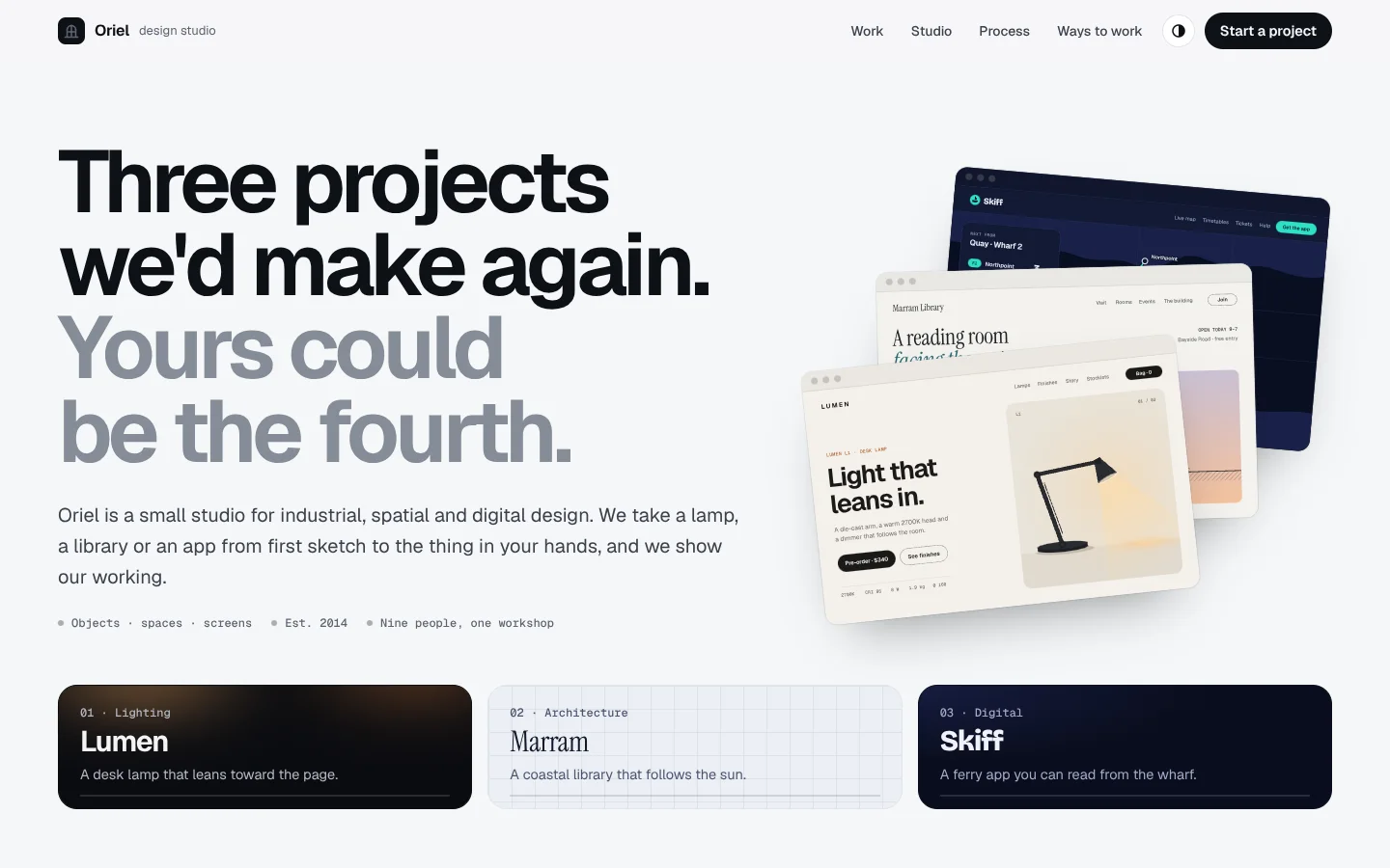
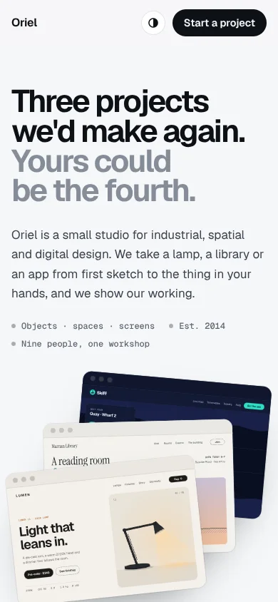
Folio is a cool, quiet page that steps back so the work can step forward. Huge, tightly tracked headlines make one plain statement and then drop to grey for the second sentence ("Three projects we'd make again. Yours could be the fourth."). Each piece of work then gets its own large rounded plate, with its own ground (ink, gridded paper, night), its own display face and its own button, and is shown in an overlapping browser and phone frame that tilts toward the pointer and can be played live. A short index of mini cards at the top, a docked index while you browse, mono eyebrows, dot bullets and colour-swatch dots with type names keep it orderly. Everything else (services, process, proof, prices, questions) sits on calm white cards and lettered option rows, the last of which inverts to ink.
Derived from the Mojo Styles showcase page (gallery/index.html), generalised for any business whose strongest argument is its work. Templates contain no Mojo branding.
| Template | template/index.html (Oriel, a fictional industrial, spatial and digital design studio: a desk lamp, a coastal library and a ferry app) |
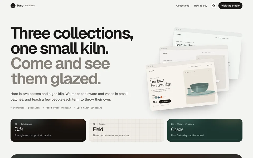
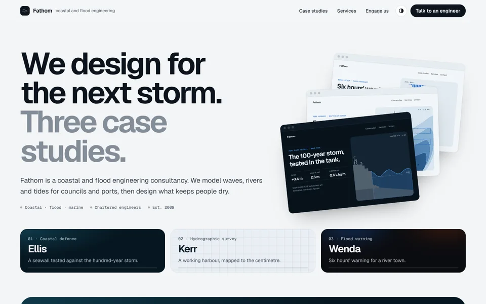
| Examples | examples/haro-ceramics (pottery with collections and classes), examples/fathom-engineering (coastal engineering consultancy with case studies) |
| Tokens | tokens.css (canonical), tokens.json (generated) |
| Modes | Light showroom by default, full dark mode from the system setting or the header button (remembered). In dark the page drops to deep ink and the plates sit lighter than it. Each frame has its own Light / Dark toggle for the work inside it. |
Best for
- Business types: design studios and agencies, architects and interior designers, photographers and illustrators (with their own images in the frames), product companies with several products, makers and manufacturers showing a catalogue, consultancies and engineering firms with case studies, software houses with a portfolio of apps.
- Audiences: clients who choose by looking ("show me what you've done"), buyers comparing a small range, procurement teams reading case studies, journalists and juries.
- Less suited to: a single product with a long sales story (use Strata), price-led or spec-led selling (use Signal), mood-first nightlife and beauty (use Aurora), or any business that has no work to show yet. Folio needs at least two pieces of real work; three is ideal, six is the most a page should hold.
Personality and voice
Quiet, sure of itself, and specific. The work does the talking; the copy introduces it like a good gallery card.
- Headlines are two sentences: a plain claim in ink, then a short invitation or turn in grey. "Three projects we'd make again. Yours could be the fourth.", "Three collections, one small kiln. Come and see them glazed.", "We design for the next storm. Three case studies.", "Have something to make? Let's draw it together."
- Plate names are one word: the product, project, collection or client (Lumen, Marram, Skiff, Tide, Ellis). Five or six letters fit best at plate size.
- One-liners say what the thing is and the one detail that makes it good: "A desk lamp that leans toward the page, and dims itself as the room gets dark."
- Eyebrows are mono, sentence case, with middle dots: Work 1 of 3 · Lighting · shipped 2025, Case study 2 of 3 · Kerr Harbour Authority · 2025.
- Buttons: Start a project, Read the case study, Shop Tide, Book a seat, Talk to an engineer. Secondary actions are underlined text links (Visit the launch site, See the drawings). The frame's own pill always says Play it live / Back to still.
- Avoid: "passionate", "bespoke solutions", "award-winning" without the award, superlatives, lists of adjectives about yourself, and any number or quote that isn't real or labelled as a placeholder.
Colour
The showroom is neutral and cool; colour lives on the plates and inside the frames.
| Token | Light | Dark | Role |
|---|---|---|---|
--page |
#f6f7f9 |
#0b0d11 |
The showroom floor. Cool, never cream. |
--card |
#ffffff |
#15181e |
Index cards, service, step, quote and option cards, FAQ. |
--sunk |
#eef0f3 |
#1c2028 |
Letter tiles, icon tiles, step drawings. |
--ink / --ink-2 / --muted |
#0e1116 / #3b414d / #5c6370 |
#eef0f4 / #c3c8d2 / #969dab |
Text, three levels. |
--fade |
#858c98 |
#6c7380 |
The grey second sentence of headlines. Large text only. |
--line / --line-2 |
#e2e5ea / #cfd4dc |
#23272f / #333945 |
Card borders; hover and outline buttons. |
--accent |
#3d5afe |
#8c9dff |
Focus rings and the odd inline link. Never a fill. |
--live / --stop |
#3ee08f / #ff5a5a |
same | The dot on Play it live, and on Back to still. |
--tool |
rgba(10,12,16,.78) |
rgba(6,7,10,.82) |
Blurred pills over the frames, the demo bar, the dock. |
--invert / --invert-2 |
#0e1116 / #1d2230 |
#f4f5f7 / #dde1e8 |
The last option card and the closing plate (inverts to light in dark mode). |
--plate-ink (+ -text, -muted) |
#0b0c10 (#f4f5f7, #b3b8c2) |
#17191f |
Dark ground, with a drifting glow in the work's colours (--glow-1..3). |
--plate-paper (+ --plate-grid, -text, -muted) |
#eceff4 (#dde2ea, #131a2c, #4a5470) |
#1b1f27 (#252a34, #eef0f4, #a4abba) |
Gridded paper ground, 24px grid. |
--plate-night / --plate-night-lift (+ -text, -muted) |
#090d1d / #161c40 (#f1f2fa, #a3a9c4) |
#10152c / #222a5c |
Night ground with a lit corner and a few stars. |
Each plate also sets its own --go-bg / --go-fg (its button) and --glow-*; each piece of work sets --w-* colours for the drawings in its frames (see Imagery).
Contrast (WCAG, measured): ink on page 17.6:1; ink-2 9.6:1; muted on page 5.6:1 and on white 6.1:1; accent on page 4.8:1. Fade on page is 3.2:1, which passes AA for large text only, so it is used only in headlines of 38px and up (the showcase page's #9aa1ad was 2.4:1 and was darkened to get there). On plates: ink-plate text 17.9:1 and muted 9.8:1; paper text 15.0:1 and muted 6.5:1; night text 17.3:1 and muted 8.3:1. Dark mode: ink 17.0:1, muted 7.1:1 on page and 6.5:1 on cards, fade 4.1:1, accent 7.8:1; plate muted text 8.8:1 (ink), 7.2:1 (paper), 7.8:1 (night). Inverted option card body text 10.3:1 (light) and 7.8:1 (dark). White on the tool pills is above 10:1 over any frame.
Typography
- Geist (Google Fonts) 400 / 500 / 600 / 650 / 700 for everything on the page.
- Geist Mono (Google Fonts) 500 for eyebrows, plate tags, type names beside swatches, step durations, URLs in the chrome.
- Plate faces: each plate may dress its name in the work's own display face. The template uses Geist 700 with a warm gradient (Lumen), Instrument Serif 400 (Google Fonts) for the library (Marram), and Bricolage Grotesque 800 (Google Fonts) for the app (Skiff). Set with
--face,--face-w,--face-trackon the plate; the matching index card repeats them.
| Use | Size | Weight | Tracking | Line height |
|---|---|---|---|---|
| H1 (intro, beside the fan) | clamp(44px, 6.3vw, 94px) (--fs-h1 is the full-width size) |
650 | −0.05em | 0.95 |
| H2 | clamp(38px, 5.4vw, 76px) |
650 | −0.045em | 0.98 |
| Closing headline | clamp(42px, 6.4vw, 96px) |
650 | −0.045em | 0.98 |
| Plate name | clamp(64px, 8.4vw, 132px) |
per plate (400–800) | per plate (−0.015 to −0.065em) | 0.9 |
| Plate one-liner | clamp(18px, 1.6vw, 22px) |
400 | 0 | 1.35 |
| Lead | clamp(17px, 1.5vw, 20px) |
400 | 0 | 1.6 |
| Card title | 18–24px | 600–650 | −0.015 to −0.03em | 1.2 |
| Body | 16px (cards 14.5–15px) | 400 | 0 | 1.6 |
| Eyebrow / tag | 12px mono | 500 | 0.02em | 1.3 |
The signature move: every headline is two sentences, the second in a <span class="fade"> that drops to its own line in grey. Balanced wrapping (text-wrap: balance), max 15–16ch. Never three sentences, never grey first.
Layout
- Wrap 1320px with 24px gutters (16px under 640px).
- Intro: 80px top padding. A two-column grid: the headline, lead and mono facts on the left (1.35fr); on the right the fan, the three pieces of work stacked like prints (1fr). Then the index: one mini card per plate, in equal columns, 56px below.
- Plates: stacked 40px apart (24px on phones). Inside, 5fr meta / 7fr stage with
clamp(28px, 4vw, 64px)gaps and padding; one column under 1100px (meta splits into two columns there), one under 640px. Optional details row spans the plate: two cards, each a small drawing beside a title, a line and a mono tag. - Stage: the browser frame (16:10 screen, 30px chrome) with 52px right and 34px bottom padding so the phone (23% wide, 390:844) overlaps its bottom-right corner. The Play it live pill and the Light / Dark toggle sit over the browser's bottom-left. Keep the important part of each drawing in the left three quarters of the screen; the phone covers the rest.
- Sections after the plates are 120px apart (88px on phones). Header: mono eyebrow, then H2 left (1.3fr) and lead right (1fr), bottom-aligned. Two-column splits (proof, ways, FAQ) use 1fr / 1.1–1.3fr with 64px gaps.
- Closing plate: an ink plate with the closing headline left and the copy and buttons right; a plain footer under a hairline.
- Spacing scale: 4, 8, 12, 16, 22, 28, 40, 56, 72, 96.
Shape
- Radii: 36px plates (26px on phones); 22px option, detail and quote cards; 20px index cards; 18px FAQ items; 14px browser frames; 26px phones (20px screens); 12px letter tiles and mini frames; 999px pills, chips and the dock. Chips are pills, except 6px on paper grounds; each plate's button radius is part of its dress (
--go-r: pill on ink, 10px on paper, 12px on night by default). - Borders: 1px
--lineon cards;--line-2on outline buttons, open FAQ items and paper-ground chips. - Shadows: almost none on the page.
--shadow-lifton hover only;--shadow-browserand--shadow-phonegive the frames weight;--shadow-detailunder detail drawings. - Glass only for the tools over the frames (Play it live, the theme toggle, the demo bar) and the dock:
--toolwith a 8–14px blur.
Motion language
Motion is on by default. It all serves one idea: the work comes forward when you look at it.
| What moves | How | Timing |
|---|---|---|
| Plates rise in (signature) | Each plate rises 80px from 0.96 scale with its corners easing from 64px to 36px; the browser and then the phone follow 70px up, 160ms apart. Only for plates not on screen at load. | 1.1s / 1.3s cubic-bezier(.2,.8,.2,1) |
| Parallax (signature) | As a stage crosses the screen the phone travels about 2.5 times further than the browser (±44px vs ±15px), so the frames separate in depth. | Scroll-linked |
| Pointer tilt (signature) | The stage tilts up to 7° / 5° toward the pointer in perspective, settling back when the pointer leaves; damped to a third while a demo plays. Not on touch. | 0.6s settle, 0.15s while tracking |
| Play it live (signature) | A light sweep crosses the frames, a LIVE chip appears in the chrome, a demo bar slides in, and the drawing inside both frames starts to work: the lamp nods and dims, the sun crosses the library, the ferries sail and the minutes count down. The phone usually shares the browser's drawing (<use>), so they move together. |
0.5s swap, then the demo's own loop |
| Scroll-spy | Index cards and dock items (any [data-spy] link) get aria-current while their plate is in the middle of the screen; index cards fill a 2px progress bar through the plate. The dock slides up while the plates are on screen. |
0.6s spring |
| Intro load | Headline, lead, facts, fan and index cards rise 18px out of a 6px blur, 90ms apart. | 0.9s |
| Ambient | Glows on ink plates drift (16s); the live dot pings (2.4s); the fan spreads on hover. | Slow |
| Hover | Cards lift 2–3px with --shadow-lift; button arrows nudge 3px; detail cards lift and lighten. |
0.35–0.4s |
Degrading. For customer sites the default follows prefers-reduced-motion; the footer Motion switch ([data-motion-toggle], html.calm, localStorage "site-motion") overrides it either way and is remembered. With motion off, plates and frames don't rise, parallax and tilt stop, glows and pings still, the fan stays put, and demos rest on their most informative frame. Play it live still works: its controls (sliders, glaze or route buttons) still change the drawing, but nothing loops on its own. Nothing is ever hidden waiting for an animation, so screenshots, print and no-JS show the full page with every frame in its still state.
Imagery and illustration
- The work is the imagery, inside frames. Every plate shows the work in a browser frame and a phone frame. For digital work that is the real site or app. For physical work it is the client's product page, configurator or case-study page, with the object drawn on it.
- Draw the work, don't stock it. The template and examples draw everything as inline SVG on a 960 × 600 browser screen and a 390 × 844 phone screen: a lamp with a jointed arm and a light pool, an architectural elevation with a sun path and poché, a harbour map with routes, a bowl with speckled glaze, a wave-tank section, a bathymetry chart. Use real photography in the frames when the customer has it (
<img>inside.screen), and still draw the live demo over or beside it where it helps. - Drawing vocabulary: shapes take
.w-bg,.w-surf,.w-soft,.w-ink,.w-mute,.w-line,.w-acc,.w-acc2(fills) and.ws-*(strokes), and text takes.w-t,.w-m,.w-s,.w-d(Geist, Mono, Serif, Display). Each piece of work sets the--w-*values for its light and[data-mode="dark"]versions, so one drawing serves both and the frame toggle works for free. - Detail cards under a plate show process: sketches, a dieline, a site model, a chair drawing, a sign, an icon grid. Small SVGs at 320 × 200 with a mono caption inside.
- Logo: a 28px rounded square in ink holding a simple line mark, beside a short wordmark and a muted descriptor.
- Icons: 1.5px line icons at 18–20px, in a 40px
--sunktile.
Signature components
- Two-tone headline.
.display/.h2with a.fadesecond sentence. - Fan. Three mini browser frames (
.fan > .mini), each a<use>of a plate's screen drawing, stacked and rotated like prints; decorative (aria-hidden). - Index.
.indexof.ixmini cards, each wearing its plate's ground (.g-ink,.g-paper,.g-night) and face, with a mono kicker, the name, a line and a progress bar. Linked to its plate, scroll-spied. - Plate.
.plate.g-*with.meta(mono.tag,.name,.one,.featsdot bullets,.scopewith "What we did" chips,.swatcheswith type or material names,.linkswith.btn-goand a text link), the stage, and optional.details. - Stage.
.stage[data-demo][data-mode]>.stage-in>.browser(.chromewith dots, mono URL and LIVE chip;.screenwith the drawing,role="img"and a plain description) +.phone>.phone-screen;.stage-toolswith[data-live-btn]and the[data-mode-btn]group;.demo-ctlwith labelled range inputs (data-var) and pressed-state buttons. - Dock. A fixed pill of the index (
.dock) that appears while the plates are on screen. - Disciplines, steps, proof. Text-led white cards with dot bullets; four process steps each with a tiny drawing that draws itself on arrival; a grid of placeholder client marks and labelled sample quotes.
- Lettered options.
.paths > .pathA / B / C with a mono price, the last.path.mixinverted to ink. Used for pricing or ways to engage. - FAQ as rounded
<details>with a plus that turns to a minus; closing plate; plain footer with the Motion switch.
Do and don't
Do
- Give every plate its own ground, face and button taken from the work itself, and keep the page around them neutral.
- Show real work, drawn or photographed, in both frames. Make the live demo do the one thing the work is about (light, sun, boats, glaze, waves).
- Keep plate names to one short word and headlines to two sentences.
- Keep the important part of each drawing clear of the phone.
- Label every placeholder: client marks, quotes, prices, figures in the frames that aren't the customer's.
Don’t
- Put more than one plate's colour on the page itself, or tint the showroom (cream, beige, saturated greys).
- Put the work in plain image cards without frames, or leave a frame static with no Play it live.
- Use the grey
--fadefor body text or small labels; it is for large headline text only. - Run more than six plates on a page, or plates without at least a stage and a name.
- Present sample quotes, client logos or figures as real. Label them until real ones, with permission and a source, replace them.
- Key motion off
prefers-reduced-motiononly: always keep the switch.
Accessibility
- Contrast as measured above;
--fadeonly at 38px and larger. - Each
.screenisrole="img"with a plain description of the work; phones, the fan and detail drawings arearia-hidden. Live demos change what's drawn, not the meaning, so the description holds. - Play it live is a
<button aria-pressed>whose label changes to Back to still; frame Light / Dark buttons usearia-pressed; demo sliders are labelled<input type="range">with an<output>; demo choices are pressed-state buttons. The demo bar isvisibility: hiddenwhile still, so it can't be tabbed to. - Scroll-spy uses
aria-currenton index cards and dock items. The dock is hidden (visibility) when off, so it never traps focus. - Visible focus: 2px accent outline, 3px offset; white outline with an accent halo on the dark tool pills. Skip link first.
- No horizontal scroll at 360px: plates stack, the phone shrinks to 30%, and under 420px the tools and demo controls move below the frames.
- Without JavaScript every plate, frame and drawing renders in its still state; only Play it live and the toggles do nothing.
How to make it yours
| Dial | What you can change | Rules |
|---|---|---|
| Showroom | --page, --card, --ink*, --fade, --line* |
Near-neutral and quiet: a hint of cool (Fathom) or warm stone (Haro), never cream or a colour. --fade must stay at least 3:1 on the page. |
| Grounds | --plate-ink, --plate-paper / --plate-grid, --plate-night / --plate-night-lift, or a new ground set inline on one plate |
Each plate gets one ground. Dark, gridded paper and night are the house set; a customer may add one ground of their own (Haro's celadon is --plate-ink: #1d3631 on one plate). Text on every ground passes AA. |
| Plate dress | --face, --face-w, --face-track, --name-grad, --go-bg, --go-fg, --go-r, --glow-1..3 |
Taken from the work's own identity. One face per plate; for sober brands use Geist on every plate (Fathom). |
| The work | Everything inside the frames, the --w-* colours, the demo (Folio.demo) |
Real nouns and numbers; one clear live behaviour per piece; still frame must make sense on its own. |
| Sections | Which sections appear after the plates, and their order | Keep the intro with index first, the plates next and the closing plate last. Lettered options keep the last card inverted. |
| Logo | Any simple line mark in the ink square, or the customer's logo | 28px; wordmark plus a short descriptor. |
| Not negotiable | The quiet showroom page, two-tone headlines, one plate per piece of work with its own ground, browser + phone frames with Play it live, the index (and dock) that scroll-spies, Geist + Geist Mono for the page, the Motion switch | These are what make it Folio. |