STYLE.md · Tactile · warm · reassuring
How Pebble works. Every rule, written down.
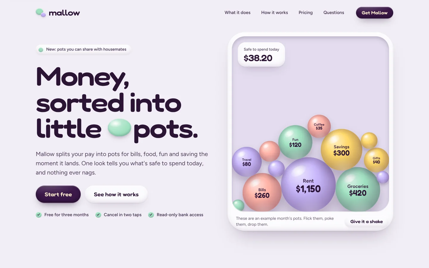
Pebble opens on a big, wide, rounded headline with a little clay pebble set into it like a word, beside a soft dish of pastel pebbles. The pebbles fall in, land with a squash and a wobble, and settle into a pile; the visitor can push them with the pointer, grab one and flick it across the dish, or tap one to make it hop. Everything else on the page is clay too: cards, buttons, switches, coins and a phone are rounded, lit from the top left, shaded underneath and lifted on long soft shadows. Press a button and it sinks in. Flip a switch and the knob snaps across with a squish. At dusk the same shapes glow instead of casting shadows.
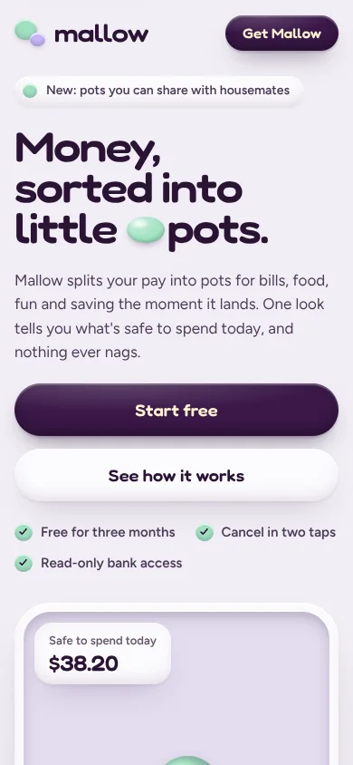
| Template | template/index.html (Mallow, a fictional budgeting app for households) |
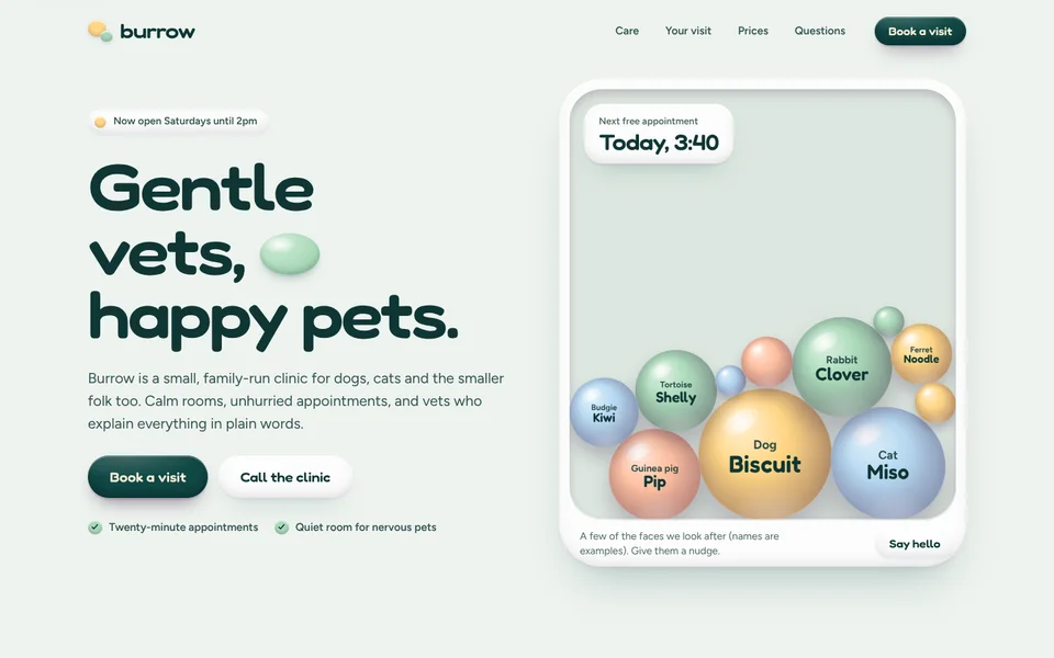
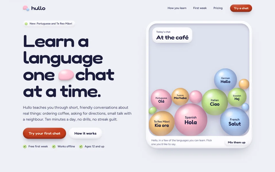
| Examples | examples/burrow-vets (family vet clinic), examples/hullo (language-learning app) |
| Tokens | tokens.css (canonical), tokens.json (generated) |
| Modes | Light by default; dusk (dark) from the system setting, with shadows turned into coloured glows. |
Best for
- Business types: consumer apps and friendly fintech (budgeting, savings, insurance), health and wellness, dentists, GPs and clinics for families, vets and pet care, kids' and family brands, education and learning apps, charities and community groups.
- Audiences: everyday people who may feel anxious, rushed or out of their depth (about money, health, a pet, a new skill) and need to feel looked after; parents; first-time customers.
- Less suited to: luxury and premium brands that should feel distant, heavy industry and B2B tools where density matters, legal or financial firms that need gravitas, anything that must look sombre.
Personality and voice
Warm, reassuring and plain. Pebble talks like a kind friend who happens to be good with the subject. It names the worry, takes it away, and says exactly what happens next.
- Headlines are short, concrete and calm, ending in a full stop: "Money, sorted into little pots.", "Gentle vets, happy pets.", "Learn a language one chat at a time.", "Gentle with you. Strict with the numbers.", "Three steps, then it mostly runs itself."
- Leads say what the thing does in one breath, then remove a worry: "One look tells you what's safe to spend today, and nothing ever nags."
- Buttons say what happens: Start free, Book a visit, Try your first chat, See how it works, Give it a shake. Never Submit or Learn more.
- Microcopy is kind and specific: "Cancel in two taps", "Two minutes, no homework.", "Nothing from Mallow between 9pm and 8am", "Treats are on us."
- Stickers (the small clay pills above headings) name the section in sentence case: What Mallow does, Your visit, Pricing. No all-caps labels.
- Avoid: jargon (leverage, seamless, solution), alarm (Don't miss out!, red warnings), guilt (streaks, you're falling behind), baby talk, exclamation marks in headlines, and fake numbers.
Colour
Four pastels and one bold colour. Pastels are pigments (pebbles, coins, knobs, dots) and, in paler tint versions, card surfaces. All text uses the deep colours; pastels never carry text on white.
| Token | Light | Dusk | Role |
|---|---|---|---|
--bg |
#f1eef5 |
#1a1322 |
The page: pebble grey with a breath of lilac. Never cream, never pure white. |
--surface |
#fcfbfe |
#261c31 |
White clay: cards, plans, phone screens, buttons. |
--sunk / --tray |
#e6e0ee / #e3dcee |
#130e19 / #150f1c |
Pressed-in wells: switch beds, meters, the pebble basin. |
--ink / --ink-2 / --muted |
#2b1435 / #4e3a59 / #67566f |
#f8f1fb / #ddcfe5 / #ae9eb9 |
Text, three levels. Deep plum in light. |
--mint --lilac --butter --blush |
#9fe0c0 #c8b7fb #ffd86a #ffb3a6 |
#8ee3bc #bca9ff #ffd664 #ffa999 |
Pigments: pebbles, coins, knobs, dots, step numbers. |
--tint-mint … --tint-blush |
#d3f1e2 #e6defd #fff0c2 #ffe2dc |
#1b3530 #2b2346 #362d18 #3c2229 |
Card and section surfaces: paler pastels in light, deep tinted clay in dusk. |
--on-pastel |
#2b1435 |
#2b1435 |
Text on a pigment. Plum in both modes, because pebbles stay pastel. |
--bold / --bold-2 / --on-bold |
#3a1748 / #4c2160 / #fff3cc |
#ffd664 / #ffe28c / #2b1435 |
The one bold colour: primary buttons, the featured plan, the phone, the closing slab. Plum in light, butter at dusk. |
--focus |
#6a2fd8 |
#ffd664 |
Focus ring. |
--ok |
#1d7650 |
#8ee3bc |
"Covered", "On track". |
--glow |
plum 28% | lilac 30% | The coloured part of every outer shadow; a glow in dusk. |
--hi / --knob |
white 60% / #ffffff |
white 7% / #f3eaf8 |
Specular highlight on clay; switch knobs. |
Contrast (WCAG, measured): ink on bg 14.6:1, on surface 16.2:1; ink-2 on bg 8.8:1; muted on bg 5.8:1, surface 6.5:1, sunk 5.2:1, tray 5.0:1 and every tint 5.2 to 5.9:1; on-pastel on the pigments 9.3:1 (lilac) to 12.2:1 (butter); on-bold on bold 13.6:1; ok on tint-mint 4.6:1, on surface 5.4:1; focus on bg 6.1:1. Dusk: ink 16.4:1, ink-2 12.2:1, muted 7.2:1 on bg and 5.3 to 5.9:1 on the deep tints; plum on butter (buttons) 12.0:1; ok on surface 10.7:1. The pastels themselves on white are 1.3 to 1.6:1, which is why they never carry text.
Typography
- Fredoka (Google Fonts), variable width and weight, used wide (
font-stretch: 108–116%) at 500–700 for headlines, buttons, numbers and pebble values. Its round terminals and inflated bowls look like the clay shapes around them. - Figtree (Google Fonts) 400–800 for body, UI labels and small print. A crisp, open geometric sans: it keeps long reading and figures calm and clear next to the puffy display, so the page never turns into a nursery.
Why this pairing: the display does the squishing, the body does the explaining. Two rounded faces (Fredoka with Nunito, say) blur together and lose hierarchy; one soft and one crisp keeps Pebble friendly but competent, which is what fintech and clinics need.
| Use | Size | Weight / width | Tracking | Line height |
|---|---|---|---|---|
| H1 (hero) | clamp(46px, 6.2vw, 92px) |
Fredoka 600 / 112% | −0.03em | 0.98 |
| Closing headline | clamp(40px, 6vw, 88px) |
Fredoka 600 / 116% | −0.03em | 1 |
| H2 | clamp(34px, 4.6vw, 64px) |
Fredoka 600 / 112% | −0.025em | 1.02 |
| Card, step and plan titles | 23px | Fredoka 600 / 108% | −0.01em | 1.15 |
| Prices and big numbers | 50–64px | Fredoka 600 / 110%, tabular | −0.03em | 1 |
| Lead | clamp(17px, 1.4vw, 20px) |
Figtree 400 | 0 | 1.55 |
| Body | 16.5px | Figtree 400 | 0 | 1.6 |
| Buttons | 15–18px | Fredoka 600 / 108% | 0.005em | 1 |
| Small print, stickers | 12.5–14px | Figtree 500–700 | 0 | 1.3–1.45 |
The signature move: a little clay pebble (<span class="nugget">) sits inside the hero headline like a word: x-height tall, lit and shaded like the pebbles in the dish. On load the headline's words spring up one by one (squash, overshoot, settle) and the nugget drops in last with a bounce, then wobbles every few seconds. JavaScript glues it to the word before it so it never starts a line. One nugget per page, in the hero only. Never colour or italicise a word for emphasis instead.
Layout
- Wrap 1200px with 24px gutters (16px under 640px).
- Hero: two columns, text left (sticker, H1, lead, two buttons, three ticked notes) and the pebble dish right, vertically centred. Stacks below 1080px, dish under the text.
- The dish: a white clay rim (14px) around a sunk basin
clamp(400px, 42vw, 590px)tall (380px on phones), with one clay chip floating in its top-left corner (Safe to spend today), and a strip underneath with a one-line hint and the shake button. - Bento of clay cards: a 12-column grid: a tall phone card (7 columns, two rows) beside two cards (5 + 5), then two cards (6 + 6). Collapses to 12 at 760px.
- One raised section slab mid-page ("How it works") in a tint, inset from the viewport edges with a 64px radius; everything else sits on the ground.
- Steps are three columns joined by a sunk groove with numbered clay pebbles on it (only for real sequences).
- Closing slab in the bold colour, 64px radius, with pebbles peeking in from its corners.
- Section rhythm 108px (88px on phones); heads are a sticker, an H2 and a lead (max 52ch), left-aligned except "how it works" and pricing, which centre.
- Spacing scale: 4, 8, 12, 16, 24, 32, 48, 72, 120, 160.
Shape
- Radii, generous everywhere and stepping down when nested: 999px pills (buttons, stickers, switches, chips); 10px small; 16px; 22–26px rows and toggle cards; 30px panels inside cards; 44px cards, plans and the basin; 58px the dish rim; 64px section slabs and the closing slab; 50% for every pebble, coin and avatar.
- Clay depth (
--shadow-clay): a 2px white inner highlight on top, a soft inner shade at the bottom, a tight contact shadow and a long, coloured outer shadow (--glow). - Lifted (
--shadow-lift): the same with a longer, softer outer shadow; for hover and the dish. - Pressed (
--shadow-press,--shadow-btn-press): the shadows invert, so the thing reads as pushed into the surface. - Sunk (
--shadow-sunk): wells, switch beds, meters, the basin. - Specular: a soft white radial highlight in the top-left of cards, buttons and pebbles (
--hi). - No hairline borders as structure (the nav gets one when scrolled). No glass, no gradients as decoration, no sharp corners.
Motion language
Motion is springy and physical: things have weight, overshoot a little and settle. It answers the visitor's hand.
| What moves | How | Timing |
|---|---|---|
| Pebble pit (signature) | Canvas verlet-style sim: pebbles drop in biggest first, bounce (restitution 0.4), squash along the impact normal and wobble back on a spring, then pile up. The pointer pushes them; grab and release to flick; tap to make one hop; Give it a shake throws them all. Stops when everything is still; paused off-screen and in a hidden tab. | Fixed 120Hz step; idle after about 0.3s of stillness |
| Headline | Words spring up from a squash (stagger 75ms); the nugget drops and squashes last, then wobbles every 7s. | 1s / 1.3s --spring |
| Buttons | Press: down 2px and squashed to 97% × 92%, shadows invert, in 0.14s. Release: springs back with overshoot. Hover lifts 2px. Enter and Space give the same press. | 0.14s in / 0.5s out |
| Switches | The knob travels on a spring and squashes (1.32 × 0.8) mid-flight; the bed fills with a pastel. | 0.55s / 0.42s |
| Cards and plans | Lift 6px with a longer shadow; the phone tilts, stickers drift apart. | 0.55s --spring |
| Price change | The new price pops in from a squash. | 0.55s |
| Coins | Coins drop onto (or leave) the stack as savings switches change. | 0.6s spring, 40ms stagger |
| FAQ | The plus turns into a minus and its well fills with butter; the answer pops in. | 0.55s |
| Scroll reveal | Cards not on screen at load pop up 34px from 94% scale with overshoot. | 0.9s, 90ms stagger |
| Ambient | Phone stickers float (6–7.5s), slab pebbles bob (7–9s). | Slow |
Degrading. The default follows prefers-reduced-motion; the footer Motion switch overrides it either way and is remembered (localStorage "site-motion", html.calm). With motion off, the pebble sim runs instantly behind the scenes and draws one still frame: the same tidy pile every time (seeded drop). Pointer play is off; Give it a shake still works and simply shows the new resting pile. Words and the nugget sit still, reveals don't play, ambient bobbing stops, hover lifts are off, and presses and switches still respond but without the overshoot. Nothing is hidden waiting for motion: without JavaScript the pots are a row of clay pills.
Imagery and illustration
- Everything is clay, built in CSS or canvas: pebbles, pills, coins, cards, switches, padlocks, a phone with a real-looking app screen. No stock photos, no image files, no emoji.
- Light comes from the top left. Every object has a highlight there, an inner shade underneath and a soft coloured shadow below (a glow in dusk).
- Objects carry the customer's nouns: pots and amounts (Mallow), pets and their names (Burrow), hellos in each language (Hullo). The phone shows the real product moment.
- Avatars are pastel pebbles with an initial. Photos, if a customer insists, sit inside a 30px-radius clay frame.
- Logo: two overlapping clay pebbles (a big one and a small one in two pastels) beside a lowercase Fredoka wordmark at 116% width.
Signature components
- Pebble dish (
.pit-wrap>.pit[data-pit]): canvas plus the<ul class="pit-list">it reads; a floating chip; a hint and the shake button. - Nugget headline: H1 with
data-wordsand one.nugget. - Clay button set:
.btn-bold(the one bold colour),.btn-soft(white clay),.btn-on-bold(on the closing slab and featured plan). - Switches:
<button class="toggle" role="switch" aria-checked>with a sunk bed and clay knob; inside cards as.togglesrows, as a billing switch with side labels, and as the footer Motion switch. - Bento cards in tints: phone with app screen and floating stickers; savings switches with a coin stack; bills list with status pills; shared pot with a squishy meter; nudges with a quiet-hours switch.
- Steps with numbered pebbles on a sunk groove and three clay objects (card, pebbles, coin).
- Speech-bubble quotes (one squared corner), each with a Sample quote pill until real ones arrive.
- Plans with a big tabular price; the pick is in the bold colour with a tilted pastel flag.
- FAQ as clay pills with a sinking plus.
- Closing slab in the bold colour with pebbles peeking in; footer with the Motion switch.
Do and don't
Do
- Keep one bold colour and four pastels. Put all text in the deep colours.
- Make the pebbles mean something: the customer's categories, services, products or words, sized by importance.
- Keep every raised thing clay: highlight top-left, shade underneath, long soft shadow. Press things in when they're pressed.
- Write like a kind expert: name the worry, remove it, say what happens next.
- Use real, keyboard-operable controls for anything that looks clickable (switches, the shake button, FAQ).
Don’t
- Put text in a pastel, or pastel text on white (1.3 to 1.6:1).
- Add a second bold colour, or the purple-to-blue gradient on white. No gradients as decoration at all.
- Use flat cards with hairline borders, sharp corners or grey drop shadows; it stops being clay.
- Put more than one nugget on a page, or highlight a word with colour or italics instead.
- Let the pebbles bounce forever: they settle, sleep when still and pause off-screen.
- Present sample quotes or placeholder figures as real.
Accessibility
- Contrast as measured above; text never sits on a raw pastel except the plum
--on-pastel. - The pebble canvas is
aria-hidden; the pots it draws are a real list (.pit-list) read by screen readers and shown as clay pills without JavaScript. The phone and decorative objects arearia-hidden. - Every switch is a
<button role="switch" aria-checked>; the savings total isaria-live="polite"; the FAQ uses native<details>; the shake button is the keyboard way into the pebbles. - Visible focus: a 3px
--focusoutline with a 3px offset on every control. Skip link first. - Buttons press in for Enter and Space as well as the pointer.
- No horizontal scroll at 360px; the dish shrinks to 380px tall and the pebbles scale with it; phone stickers hide on small screens.
How to make it yours
| Dial | What you can change | Rules |
|---|---|---|
| Pastels | --mint, --lilac, --butter, --blush and their --tint-* |
Four soft, clear pastels that sit well together; light tints in light mode, deep tinted clay in dusk. Garden: sage, sky, butter, peach (Burrow). Playground: lime, sky, apricot, bubblegum (Hullo). |
| The bold colour | --bold, --bold-2, --on-bold |
One deep, saturated colour that carries buttons and the closing slab at AA with --on-bold: plum (Mallow), forest teal (Burrow), tomato (Hullo). In dusk it becomes a light pastel or warm tone with deep text. |
| Ink and ground | --ink, --ink-2, --muted, --on-pastel, --bg, --surface, --sunk, --tray |
Ink is a deep version of the bold colour's family; the ground is a soft tinted grey (green for Burrow, cool blue-grey for Hullo). Re-measure muted on every tint. |
| Pebbles | The .pit-list items: name, value, tone, data-size; data-extra small unlabelled pebbles |
6–9 labelled pebbles, sizes 0.55–1.35, biggest is the most important thing. Keep labels short. |
| Chip and hint | The floating .safe-chip and the hint under the dish |
One useful live-looking fact (next appointment, today's lesson). |
| Vignettes | The phone screen, card contents, steps objects | Built in CSS with the customer's nouns; one clear interaction per card. |
| Logo | The two-pebble mark's colours or shape, or the customer's logo | Rounded, lowercase or sentence-case wordmark. |
| Not negotiable | The pebble dish with physics, clay depth on everything raised (shadows invert on press), Fredoka wide + Figtree, four pastels plus one bold colour with text in the deep colours, generous radii, dusk as glows, the Motion switch | These are what make it Pebble. |