STYLE.md · Luminous · nocturnal · premium
How Aurora works. Every rule, written down.
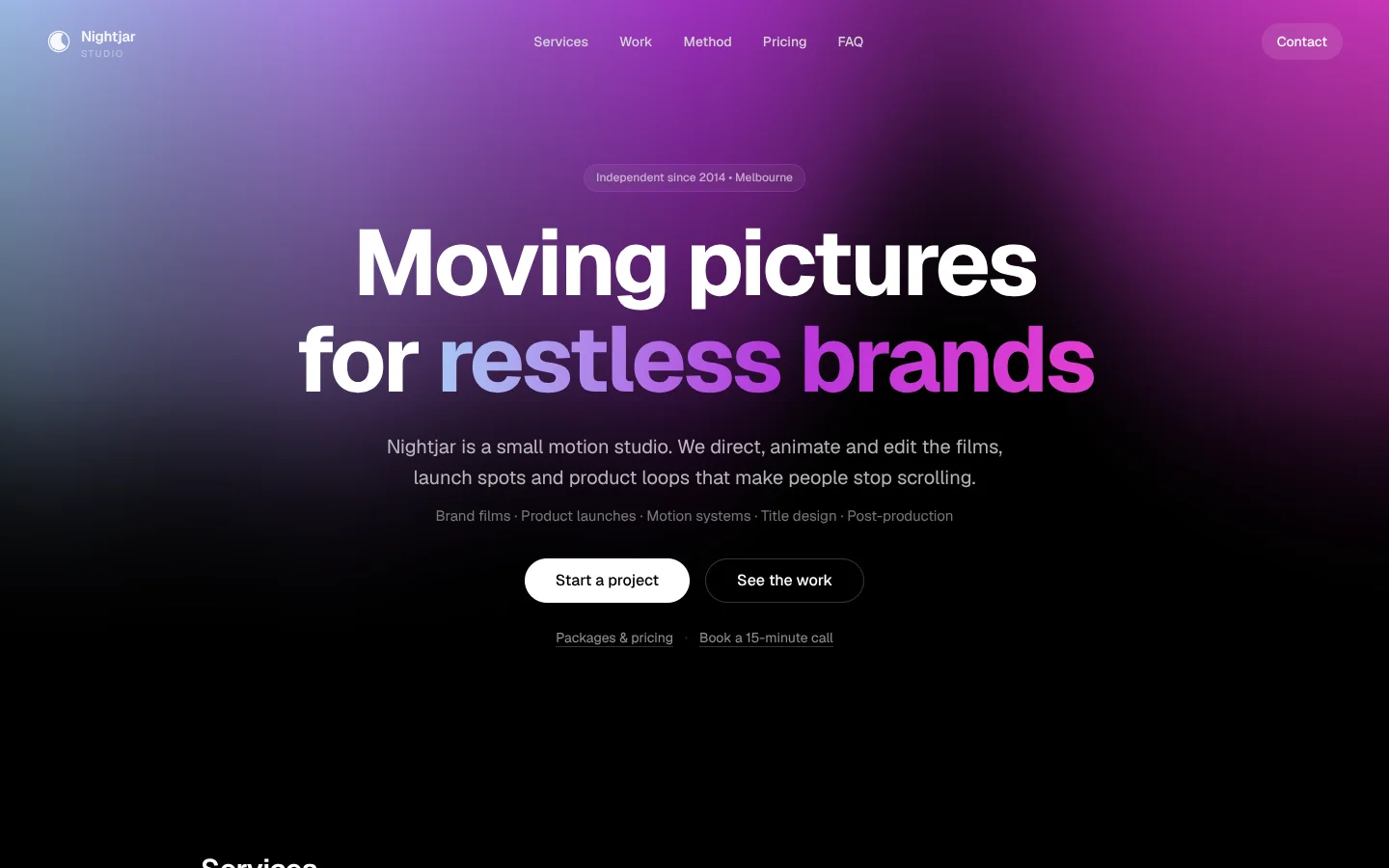
Aurora is a night-first identity. The page is true black and a slow, full-screen field of light (an aurora ribbon, venetian blinds of colour, an iridescent fold or tall satin beams) moves behind everything. Content floats above it on frosted glass in a single centred column. The UI itself is almost colourless: white type, white pill buttons, hairline borders. The only colour inside the content is the spectrum gradient, used on one phrase per headline, on hairlines and on featured borders.
Derived from the Mojo Layers studio site. Templates contain no Mojo branding.
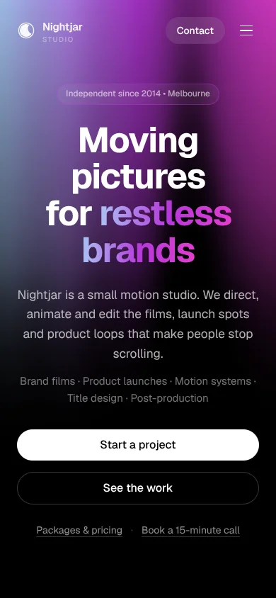
| Template | template/index.html (Nightjar Studio, a fictional motion studio) |
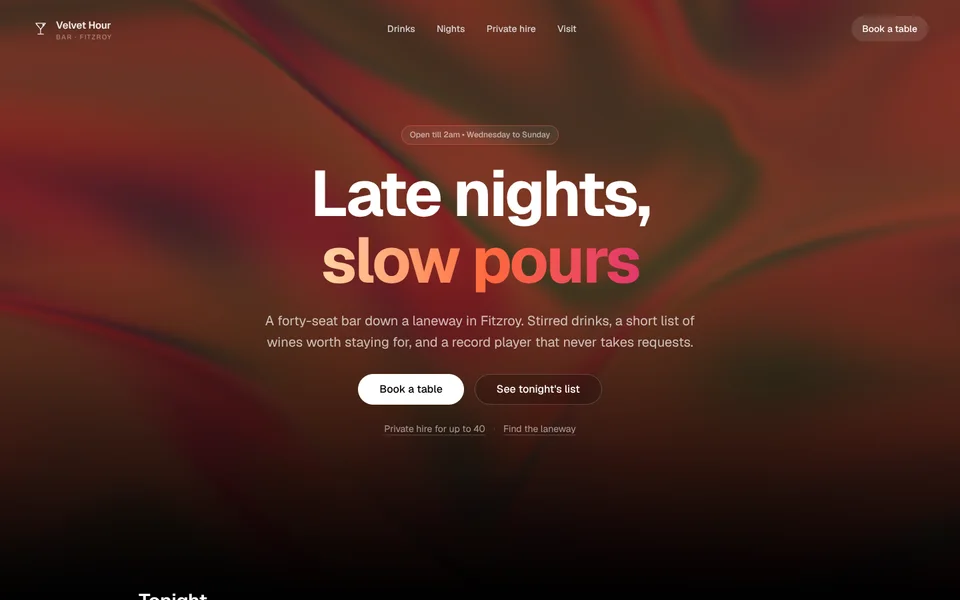
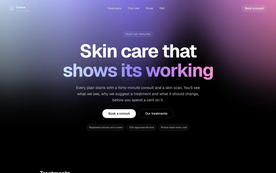
| Examples | examples/velvet-hour (cocktail bar), examples/solace-clinic (skin clinic) |
| Tokens | tokens.css (canonical), tokens.json (generated) |
| Modes | Dark only for websites. A light "Pearl" token set exists for print, PDFs and email. |
Best for
- Business types: creative and production studios, agencies, premium tech and AI products, nightlife and hospitality after dark, beauty and aesthetics clinics, music, events and festivals, luxury retail with a night personality.
- Audiences: people who judge quality by feel before reading a word; consumers choosing a premium option; clients hiring for taste.
- Less suited to: information-dense sites (government, healthcare portals, documentation), businesses whose customers browse in bright daylight on old phones, anyone who needs a light-mode website. For those, see Signal.
Personality and voice
Confident, quiet and short. Aurora lets the light do the talking, so copy is spare and declarative. It never shouts and never explains the obvious. Sentence case everywhere.
- Headlines pair a plain statement with a spectrum phrase: "Moving pictures for restless brands", "Late nights, slow pours", "Skin care that shows its working".
- Lead copy says who you are and what you make in one or two sentences. Specific nouns, no adjectives stacked three deep.
- Buttons: verbs that say what happens. Start a project, Book a table, Send a brief, See the work. The primary is always a white pill; the secondary is glass.
- Microcopy: "Packages & pricing", "Placeholder marks. Replace with your clients' logos, with their permission.", "Client and show name withheld.", "Typical timeline: 3–4 weeks".
- Avoid: exclamation marks, "unleash", "elevate", "cutting-edge", emoji, ALL-CAPS headlines.
Colour
Aurora's palette is black, white, glass and one three-stop spectrum. Everything else is white at an opacity.
| Token | Hex / value | Role |
|---|---|---|
--void |
#000000 |
Page. True black so the light glows. |
--ink |
#ffffff |
Headings, primary text, the CTA pill. |
--ink-2 |
rgb(255 255 255 / .72) |
Body copy. |
--muted |
rgb(255 255 255 / .56) |
Secondary copy. |
--faint |
rgb(255 255 255 / .42) |
Captions, meta, labels. |
--glass |
rgb(255 255 255 / .05) |
Standard card fill (with 12px blur). |
--glass-2 |
rgb(255 255 255 / .08) |
Featured or hovered card. |
--glass-dark |
rgb(0 0 0 / .32) |
Quiet card: reads as a hole in the light. |
--line |
rgb(255 255 255 / .10) |
Card borders. |
--ice |
#a8c9f6 |
Spectrum stop 1 (cool). |
--violet |
#b637db |
Spectrum stop 2 (saturated mid). Also the light field's main colour, scrollbar and selection. |
--magenta |
#e43dd1 |
Spectrum stop 3 (hot). |
--lilac |
#e3a8ff |
Links, featured borders and "Popular" pills on black. |
--spectrum |
ice → violet → magenta |
Gradient text, hairlines, the Motion switch. |
--st-live / open / soon / dev |
emerald / sky / amber / violet tints | Status pills (outline only). |
Light and dark. The website is always dark (color-scheme: dark). The [data-theme="light"] "Pearl" block in tokens.css swaps to #fbfaff paper and near-black ink for invoices, proposals and email signatures, where the brand must survive a white page.
Contrast. White on black is 21:1. Body copy at 72% white on black is about 13:1; --faint (42%) is about 6:1, the minimum we use for text. The light field is brightest at the top of the screen and fades towards the bottom, so most copy sits on near-black. Where a card sits over the brightest light (the Iridescence show fills the whole screen), check body copy against what's behind it and switch that card to --glass-dark if it drops below 4.5:1. Never put body copy directly on the light field without a card or the hero's dark vignette. The spectrum gradient is decorative: never use it for small text or the only signal of meaning.
Typography
One family, used with discipline.
- Geist (Google Fonts) 400 / 500 / 600 / 700 for everything.
- Geist Mono (Google Fonts) 500 for case IDs and codes only (
CF-07).
| Use | Size | Weight | Tracking | Line height |
|---|---|---|---|---|
| Hero headline | clamp(48px, …, 96px) |
700 | −0.035em | 1.04 |
| Section title | clamp(24px, …, 30px) |
600 | −0.02em | 1.2 |
| Card title | 18px (14px in small tiles) | 600 | 0 | 1.3 |
| Lead | clamp(17px, …, 20px) |
400 | 0 | 1.6 |
| Body / card copy | 15px / 14px | 400 | 0 | 1.6–1.65 |
| Labels ("Output:", status) | 10px uppercase | 700 | 0.16em | 1 |
The signature move: one phrase per headline set in the spectrum gradient with background-clip: text. Give it inline padding (0 .06em .08em, with matching negative margin) so descenders and the last glyph are never clipped. Never more than one gradient phrase per headline, never in body copy.
Layout
- One column. Content sits in a centred
1024pxcolumn withclamp(24px, 4vw, 48px)gutters. The header spans the full width. - Hero is centred, at least 70% of the viewport tall, with a badge, a two-line headline, a lead, a one-line service list and two pill buttons, all centred.
- Grids: 2-up for services and case files, 4-up for pricing and small tiles, a 2×2 + tall proof tile bento for featured work. Everything collapses to one column at 560px.
- Spacing scale (4px base): 4, 8, 12, 16, 24, 32, 48, 64, 96, 128. Sections are 96px apart (64px on phones). Section heads: title, a 96px spectrum hairline, then a short muted line.
- Rhythm: hero, then alternating card grids and quiet text sections; a centred quote and a dark glass CTA panel close the page. Long pages stay readable because the light field fades towards the bottom of the screen.
Shape
- Radii: pills
999pxfor every button and chip; cards16px; large and featured cards24px; small controls10px. - Borders: 1px white at 10% on cards, 20% on controls, 40% on hover.
- Shadows: none. Depth comes from blur and from the light behind.
- Glass:
backdrop-filter: blur(12px)on every card; the mobile menu uses 24px blur over 80% black. - Hazard stripes (
135deg, amber at 7%) mark redacted, under-NDA work.
Motion language
| What moves | How | Timing |
|---|---|---|
| The light field (signature) | WebGL shader, full screen, behind everything. Four shows: Aurora, Blinds, Iridescence, Beams. One is picked per visit (or fixed per site) and the footer chip cycles them with a 0.45s cross-fade. Blinds and Iridescence follow the pointer with 0.15s easing. | Continuous, slow |
| Page load | Badge, headline, lead, buttons rise 20–30px and fade in, 150ms apart. | 0.5s cubic-bezier(.25,.46,.45,.94) |
| Scroll entrances | Cards rise 24–30px with a gentle spring, staggered 60–120ms within a grid. Section hairlines draw from the left. | 0.5s fade, 0.7s cubic-bezier(.22,1.18,.36,1) |
| Buttons | White pill scales to 1.05 on hover, 0.95 on press. | Spring cubic-bezier(.34,1.36,.64,1) |
| Disclosures | Height opens on a spring, content fades in after 50ms. | 0.5s |
| Page transitions | Cross-document view transitions fade between pages. | 0.25s out, 0.45s in |
Performance. The light renders at 75% resolution (it is soft, so this is invisible), caps device pixel ratio at 1.5, and pauses when the tab is hidden. No libraries: plain WebGL 1 with a CSS fallback wash when WebGL is missing.
Degrading. Motion is on by default, but for customer sites the default follows the visitor's prefers-reduced-motion. A Motion switch in the footer lets every visitor turn it on or off, and the choice is remembered. With motion off, the light field is drawn once and held still: the page keeps its colour and depth, it simply stops moving. Nothing is hidden waiting for an animation; content is visible without JavaScript.
Imagery and illustration
- The light field is the imagery. Most Aurora pages need no photography at all.
- When photos are needed (bar interiors, treatment rooms, film stills), use dark, low-key images with one light source, crop tight, and sit them in a 24px-radius card with a 10% white border. Never place a bright daylight photo on the page.
- Icons: 1.5px line icons, white at 70–90%. Logos in white, single colour.
- Client logos: single-colour white at ~40% in a strip between hairlines.
Signature components
- Light field + light chip. The fixed WebGL background and the footer chip ("↻ Aurora") that cycles shows.
- Spectrum headline. Bold white headline with one gradient phrase.
- Badge. Small glass pill above the hero headline with a violet-tinted border: "Independent since 2014 • Melbourne".
- Pill pair. White primary pill and glass secondary pill, side by side; quiet underlined text links below.
- Glass card with "Output:" label. Service card: tiny uppercase label, title, one line, dot list.
- Proof tile. Large card with a diagonal white wash, a violet glow in the corner, a kicker pill, a numbered list of steps and a link.
- Case file. Mono ID, outline status pill, title, summary, dot list and stack chips. The redacted variant adds hazard stripes, a white redaction bar and "Classified · NDA".
- Method. Four numbered circles on a spectrum line, for real sequences only.
- Disclosure. Glass accordion with question, sub-line and a chevron that flips on a spring.
- Halo. A soft spectrum glow under the closing CTA panel so the page ends lit.
Do and don't
Do
- Keep the page black and the content in one centred column.
- Use the spectrum once per headline, and on hairlines and featured borders.
- Put every block of body copy on glass or the hero vignette.
- Pick the light show that matches the business (Aurora for calm, Iridescence for warmth and texture, Beams for tech and drama, Blinds for bold and graphic) and limit the cycle with
data-showsif some don't suit.
Don’t
- Add a light mode to the website, or a coloured page background.
- Use coloured buttons. Primary is always a white pill.
- Add drop shadows, gradients on cards, or a second accent colour.
- Run two light fields on one page, or put the light inside cards.
- Re-tune the spectrum so its middle stop is pale: the light field needs a saturated middle.
Accessibility
- Text contrast: body and captions ≥ 4.5:1 against whatever is behind them, including the light. Don't go below
--faintfor any text. - Visible focus: 2px
--lilacoutline, 3px offset, on every interactive element; a skip link is the first focusable element. - The light field is
aria-hiddenandpointer-events: none; it never carries information. - Motion switch with
role="switch"; reduced-motion respected by default; no flashing (no show changes faster than 0.45s, no strobe). - Disclosures use real buttons with
aria-expanded; the mobile menu usesaria-expanded, closes on Escape and isinertwhen closed. - Tested to 360px wide with no horizontal scroll.
How to make it yours
| Dial | What you can change | Rules |
|---|---|---|
| Spectrum | --ice, --violet, --magenta (and --lilac, --orchid to match) |
Keep it cool → saturated → hot, left to right. Middle stop at mid lightness and high saturation. Examples: warm champagne → ember → rose (Velvet Hour), pearl sky → periwinkle → blush (Solace). |
| Light show | data-show (default show) and data-shows (which ones the chip cycles) on the canvas |
Choose one default per site. Restrict the cycle if a show clashes with the brand. |
| Logo | Any single-colour mark, rendered white | Sits top-left at ~26px with the name in 600 weight. |
| Copy | All of it | Follow the voice above; one gradient phrase per headline. |
| Sections | Add, remove or reorder | Keep the hero first and a CTA panel last. |
| Photography | Dark, low-key images in rounded glass cards | No daylight photos, no full-bleed photos behind the light. |
| Not negotiable | Black page, white pill CTA, glass cards, one centred column, Geist, the spectrum rule, the Motion switch | These are what make it Aurora. |